1
2
3
4
5
6
7
Project Kickstart
Research
Persona
Design
Prototyping
User Study
Deliver
Final Solution
NYC 411
Overview
Challenge
As a team we decided to address the challenge faced by many New Yorkers
in finding free or affordable events and public resources in NYC. Our goal was to create a platform that is both informative and accessible that can be a “go-to" for all things New York City related. Our project emphasizes the collaboration with NYC 311, and references the use of APIs including ChatGPT and Google’s geolocation to ensure easier navigation and a seamless user experience. Ultimately, we prioritized creating a platform that centralized information on events, public resources, affordable restaurants, and accessible bathrooms.
As a team we decided to address the challenge faced by many New Yorkers in finding free or affordable events and public resources in NYC. Our goal was to create a platform that is both informative and accessible that can be a “go-to" for all things New York City related. Our project emphasizes the collaboration with NYC 311, and references the use of APIs including ChatGPT and Google’s geolocation to ensure easier navigation and a seamless user experience. Ultimately, we prioritized creating a platform that centralized information on events, public resources, affordable restaurants, and accessible bathrooms.
New Yorkers struggle to find events and places in NYC. There are no integrated platform for comprehensive information yet. They rely on digital tools like websites and maps systems however, those platforms are lacking of centralized data on public resources and amenities.
How might we find a way for individuals who frequent NYC with opportunities to learn about all of the affordable events and resources that NYC has to offer?
Figma, Google Workspace, Otter AI, Notion, Slack, Keynote
Figma, Google Workspace, Otter AI, Notion, Slack, Keynote
Business Model Canvas, Competitive/Comparative Feature Analysis, Feature Comparison, User Interviews, Affinity Mapping, User Persona, Feature Prioritization Matrix, Sketching & Design Studio, Wireframing, Prototyping & Iterating, Usability Testing, Heart Framework
Methodologies
Tools
My Role
Project Manager, designer
Timeline
2-week sprint
View
Figma Prototype
An app for discovering free and affordable NYC events
Solution
A centralized platform where New Yorkers can search, discover, and filter from a variety of free/cheap activities in NYC.
Social: Help New Yorkers foster a deeper connection to their community by connecting them to events and places where they can meet others, especially those with similar interests.
Explorative: Fuel the curious and explorative side of New Yorkers by serving as a comprehensive guide for discovering what the boroughs have to offer.
Informative: Ensure New Yorkers don’t feel left in the dark by being a reliable source of information for free, public resources.
Accessible: Provide more bathroom visibility by informing New Yorkers where they can find and access bathrooms nearby, while also ensuring they can find bathrooms with the amenities they need (diaper changing table, wheelchair accessibility, cleanliness, etc.).
Our Process
A look into our methodology
Research
Hypothesis
Individuals who frequent New York City want to learn about free events, public resources, cheap restaurants, and accessible bathrooms in different NYC locations.
New Yorkers don’t know what public resources are available to them.
New Yorkers like to have a list documenting places they would like to visit.
New Yorker’s want free or cheap events/food/parks/museum
Assumptions
Research Methods
To give us insight into the current market space, and potential businesses that we could benefit from partnering with:
To ideate and test our design concepts, and how we could measure KPIs:
Business Model Canvas
Competitive/Comparative Feature Analysis
Feature Comparison
Feature Prioritization Matrix
Design Studio
Prototyping
Usability Testing
Heart Framework
Before we conducted our research we brainstormed a list of assumptions to help guide us through our research.
To better empathize with our client & target audience we conducted various research techniques to further our understanding and validate our assumptions. We completed the following research methods to establish a solid foundation before continuing toward the redesign:
Feature Comparison & Competitive Analysis
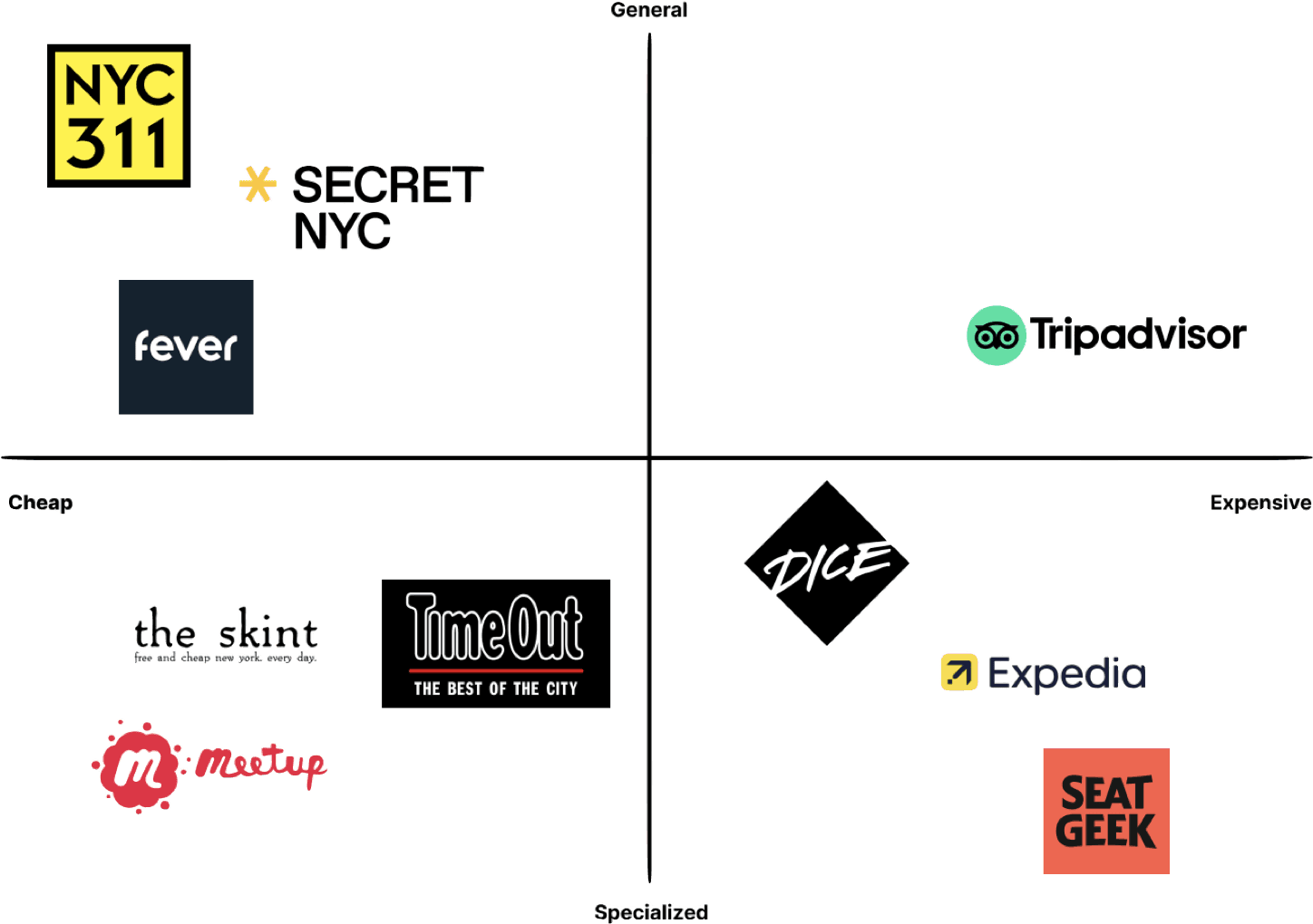
We conducted a competitive analysis and feature comparison of existing businesses NYC 411 could potentially partner up with. We found out that NYC 311 has the largest NYC audience base out of all the businesses we researched, as the app is directed towards connecting New Yorkers to a channel where they can file complaints or learn about available public resources.
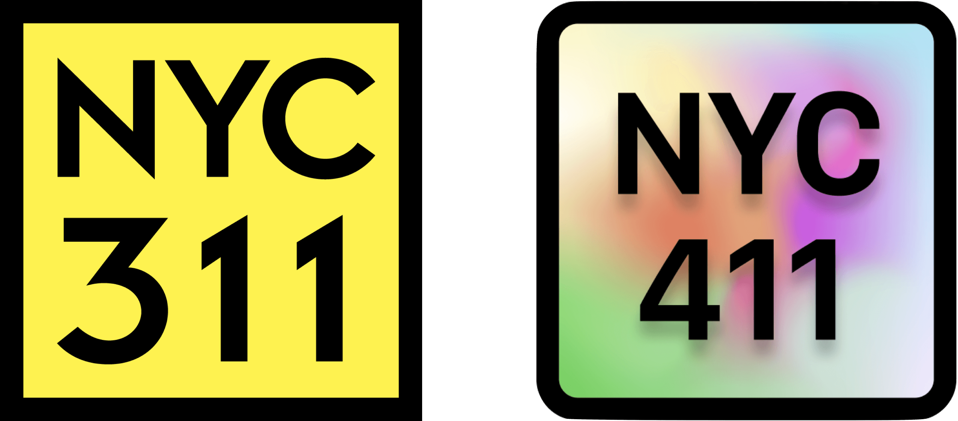
Our biggest takeaways were that NYC 311 has many of the features we would like to focus on for our own app, but is missing many of the features their top competitors have. By partnering with NYC 311, we could provide their audience with features that are pivotal to our app, NYC 411, such as: price filters, a calendar view, and of course, a focus on discovering free and affordable events and resources.
Check out the link below for the full analysis!
Feature Comparison
User Interviews
Who are we designing for?
For our interviews, we wanted to make sure we were interviewing New Yorkers as they would give us the most relevant and recent feedback on their New York experiences. Using a screener survey, we were able to find 5 individuals who frequent at least one NYC neighborhood on a regular basis.
Quotes from New Yorkers
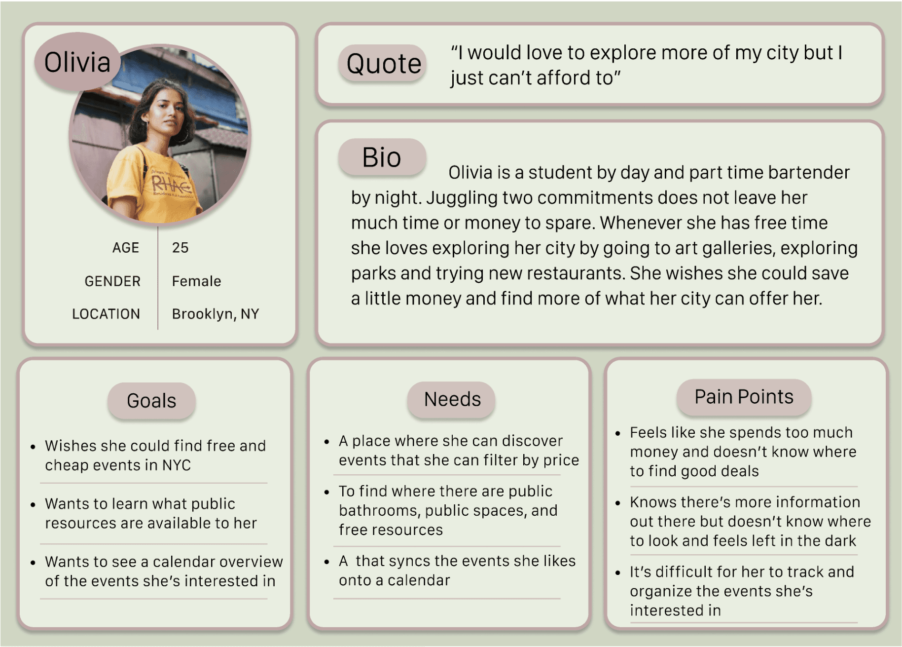
Let’s Meet Olivia...
After conducting our interviews, we created a persona to represent our target audience. Our persona in this case is Olivia. Olivia helped guide our design decisions, as we specifically implemented product features to best meet her needs and mitigate her pain points.
“Why is it so hard to find fun activities?”
“What resources does NYC offer?”
“I wish it was easier to save my events”
“I love finding good deals.”
Key Takeaways
Olivia wants to go to free/cheap events but doesn’t know where to find them.
Olivia has trouble learning what public resources are available to her.
Olivia wants to organize her events onto a calendar.
Olivia wants to go to free/cheap events but doesn’t know where to find them.
Olivia has trouble learning what public resources are available to her.
Olivia wants to organize her events onto a calendar.
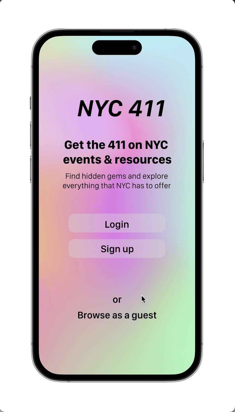
Introducing NYC 411...
Introducing NYC 411...
1
2
3
4
5
6
7
Project Kickstart
Research
Persona
Design
Prototyping
User Study
Deliver
Final Solution
User interviews
Affinity Mapping
Synthesis
Persona
To understand NYC 411’s target audience and align our designs with the needs and pain points of their users we conducted the following:

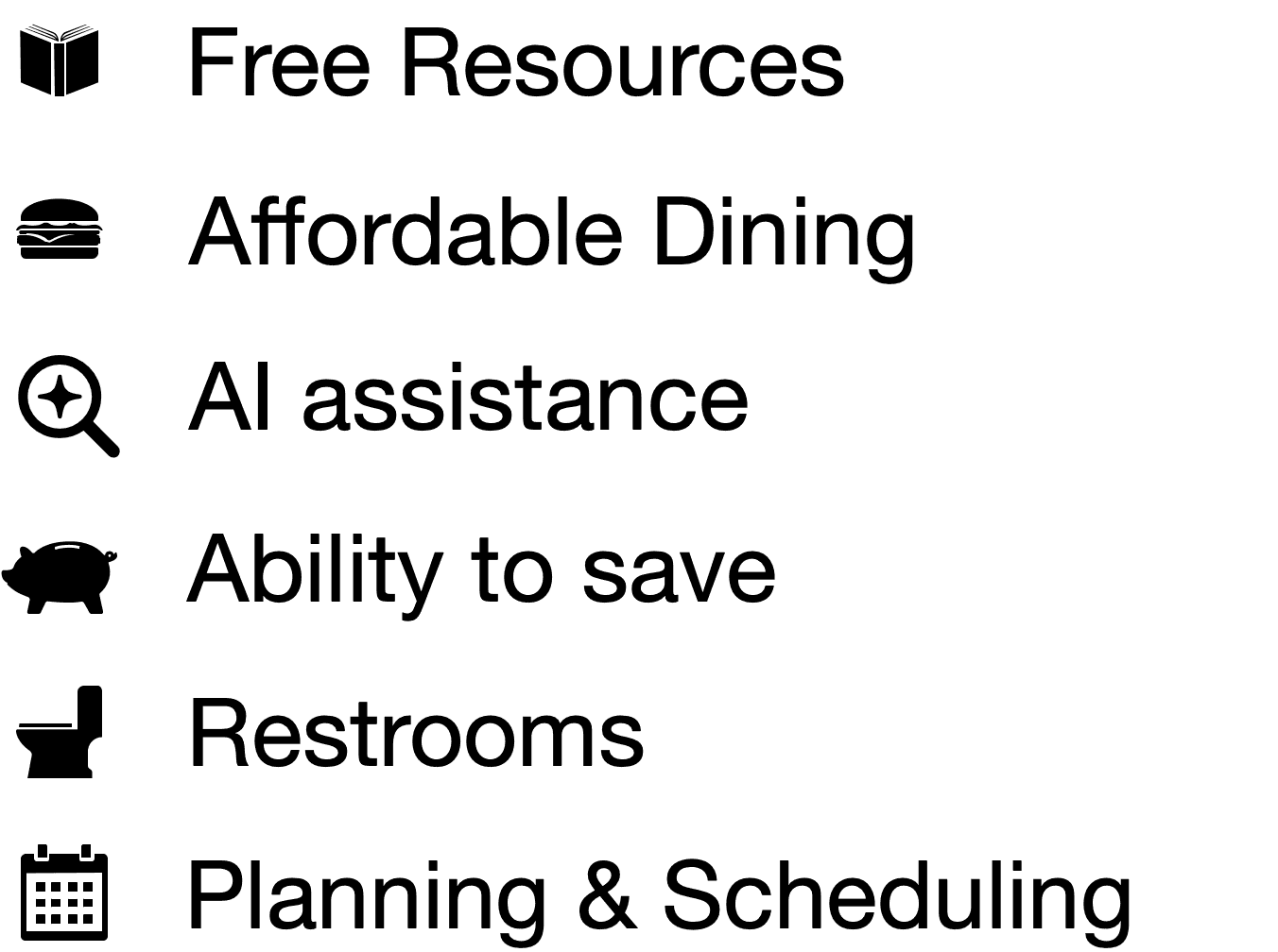
Price Filtering
Calendar view
Free and affordable


Affinity Mapping
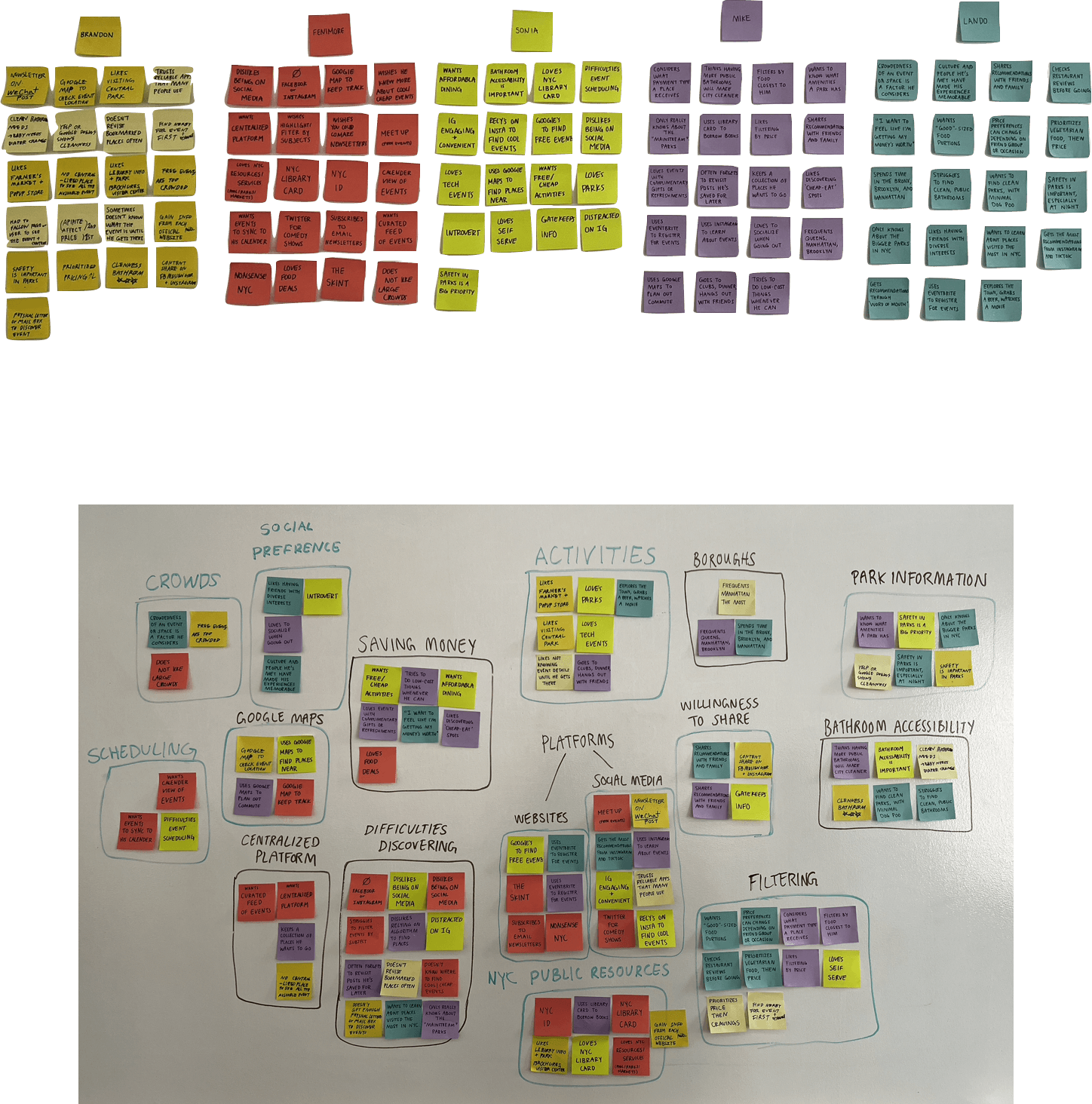
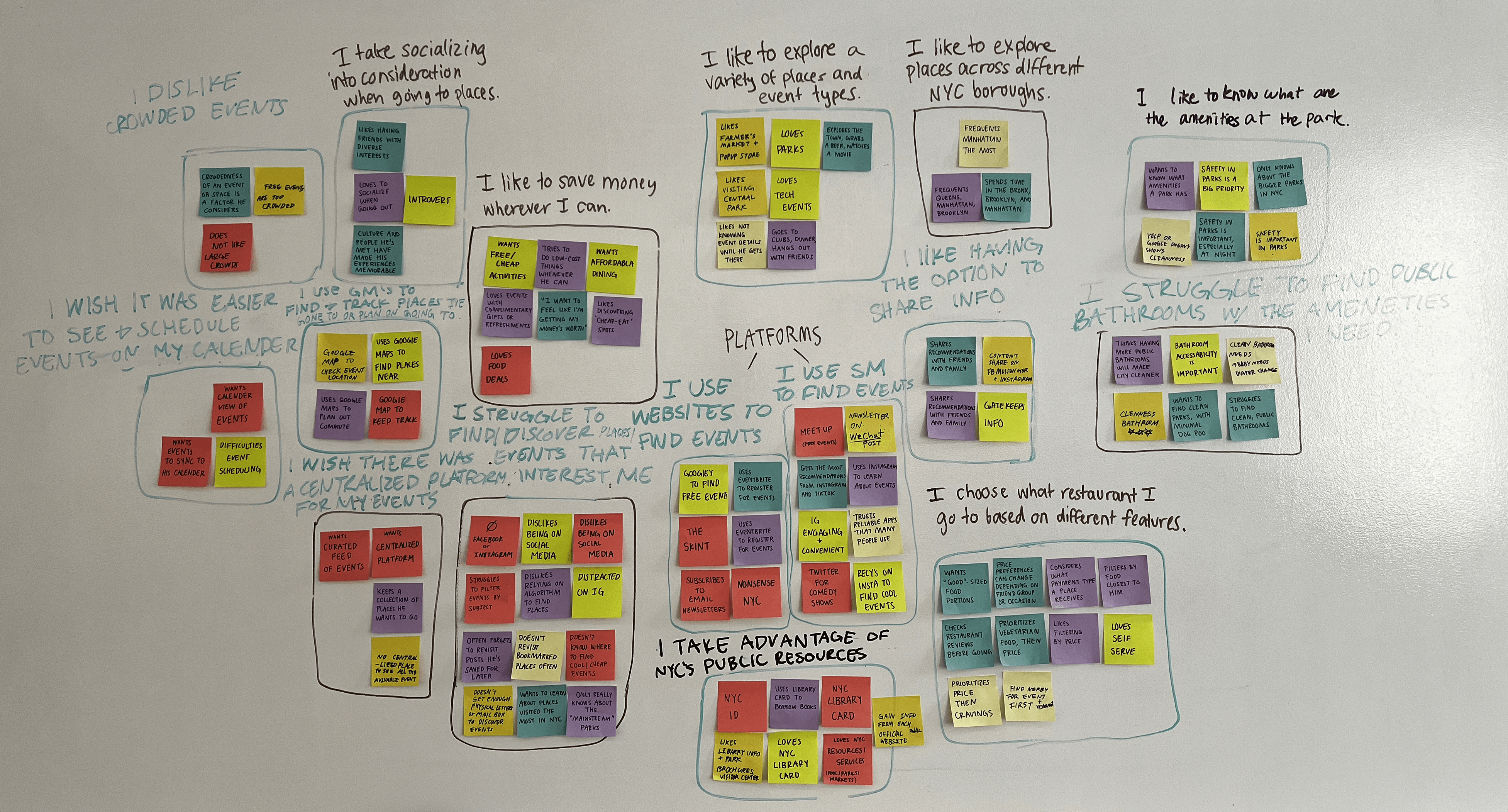
Through affinity mapping, we decided to focus on themes for difficulty discovering, NYC public resources, and saving money. We then pulled the following “I” statements from the category
themes we created during affinity mapping. They helped give us a focus for creating our persona.


Key Features
Key Features


Design Changes
Design Changes
Picking Flowers Event
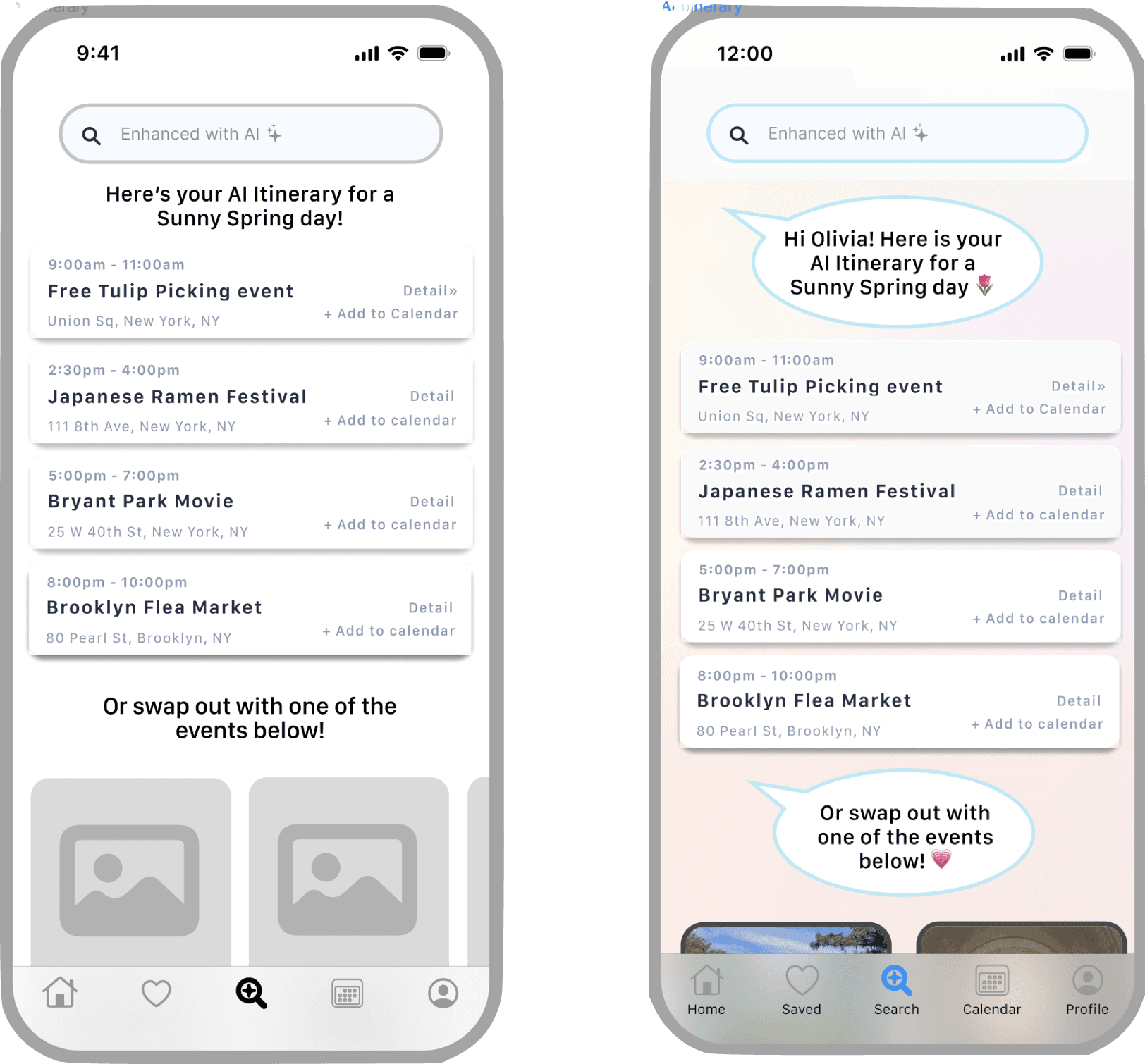
Planning Itinerary with AI
Saving a Free Event
Planning an Itinerary with AI
Planning an Itinerary with AI
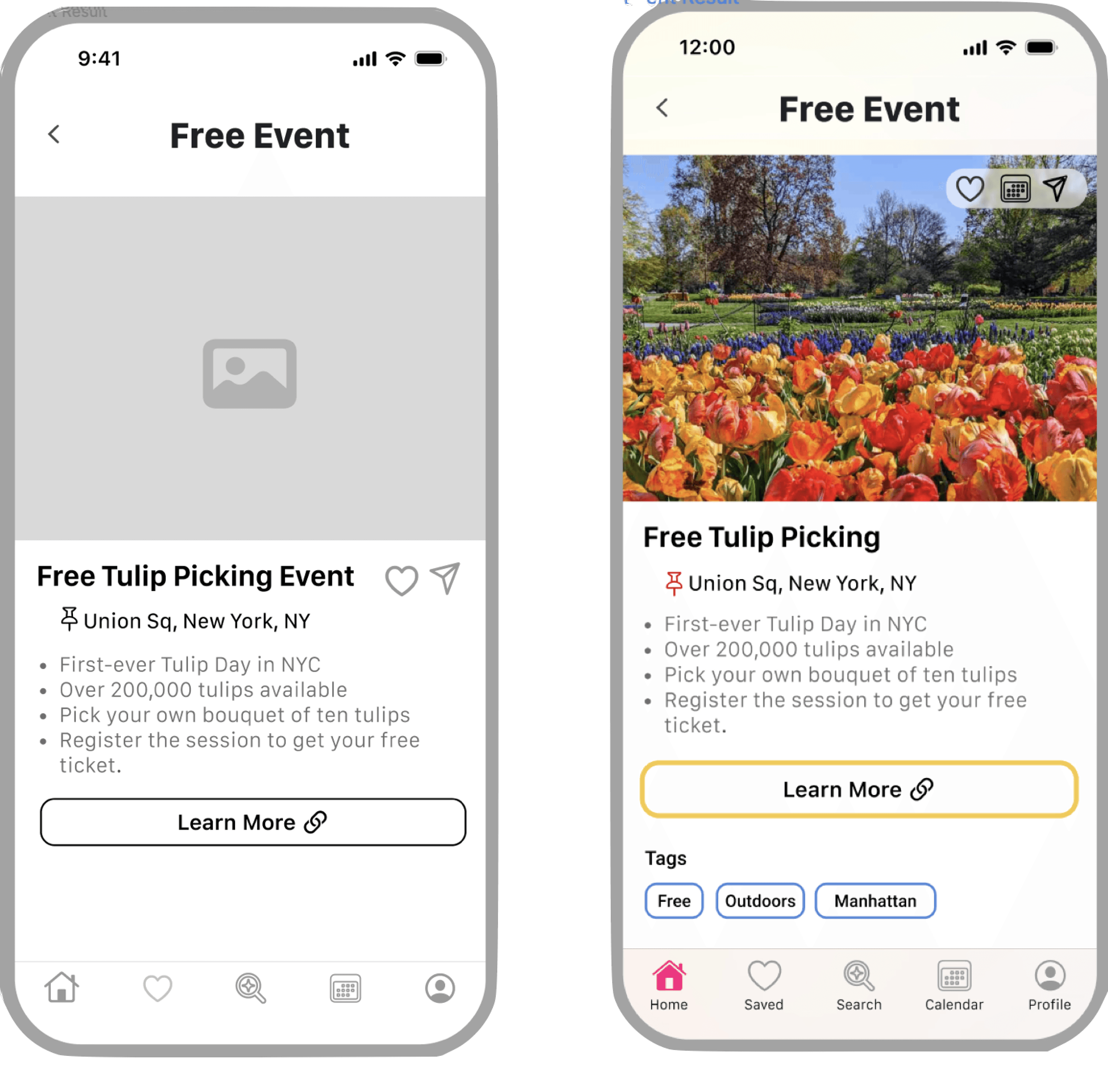
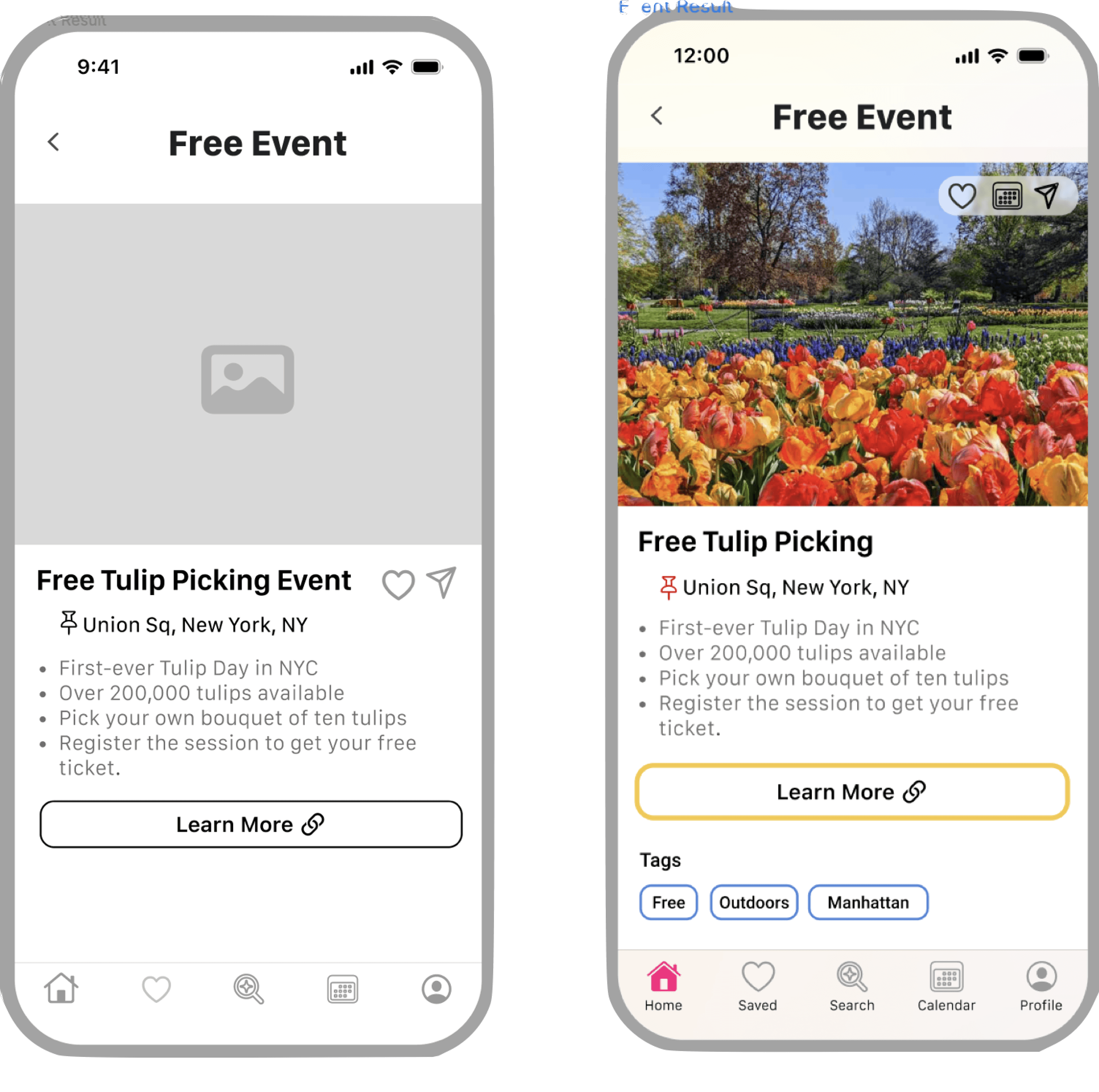
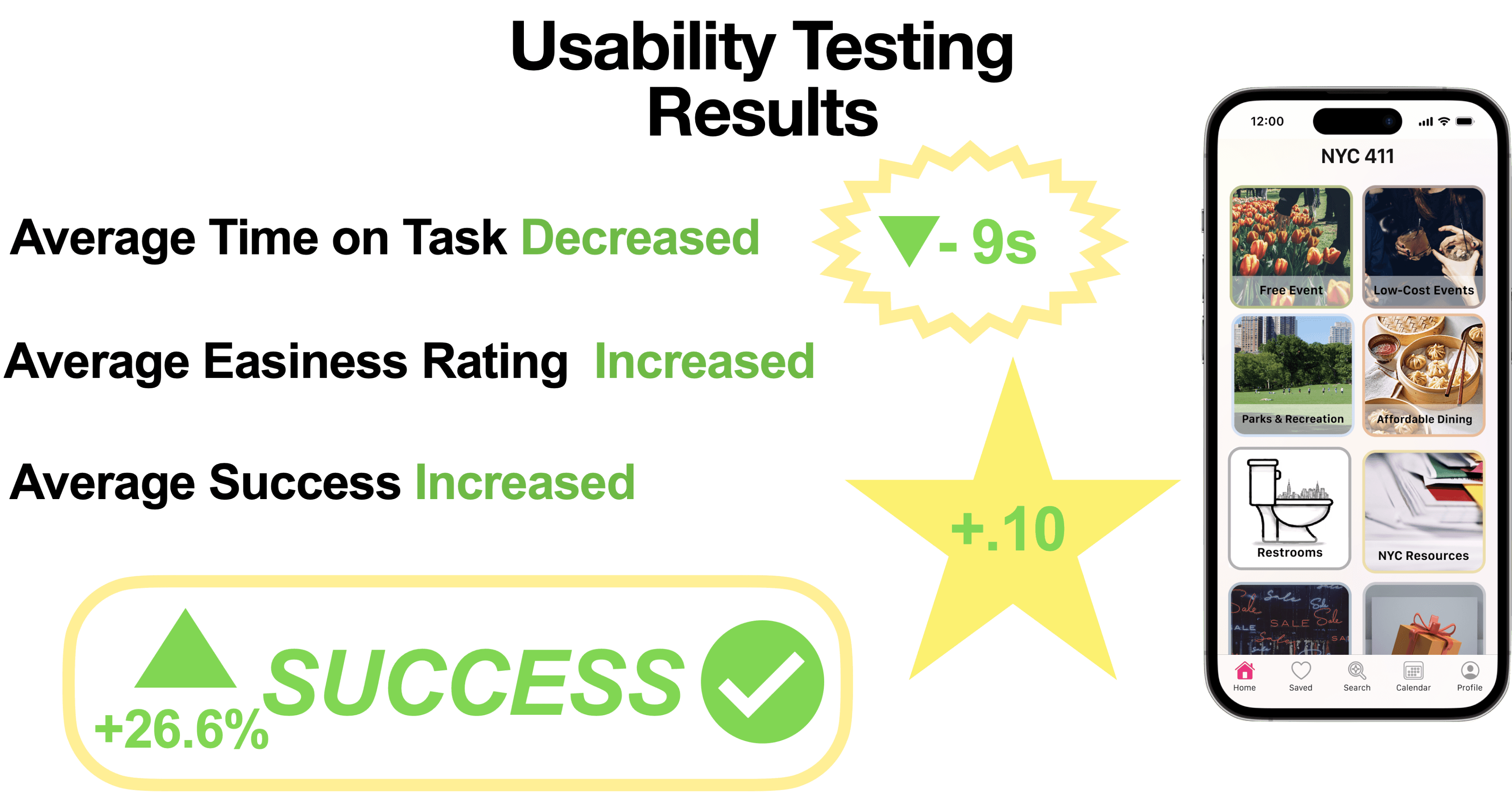
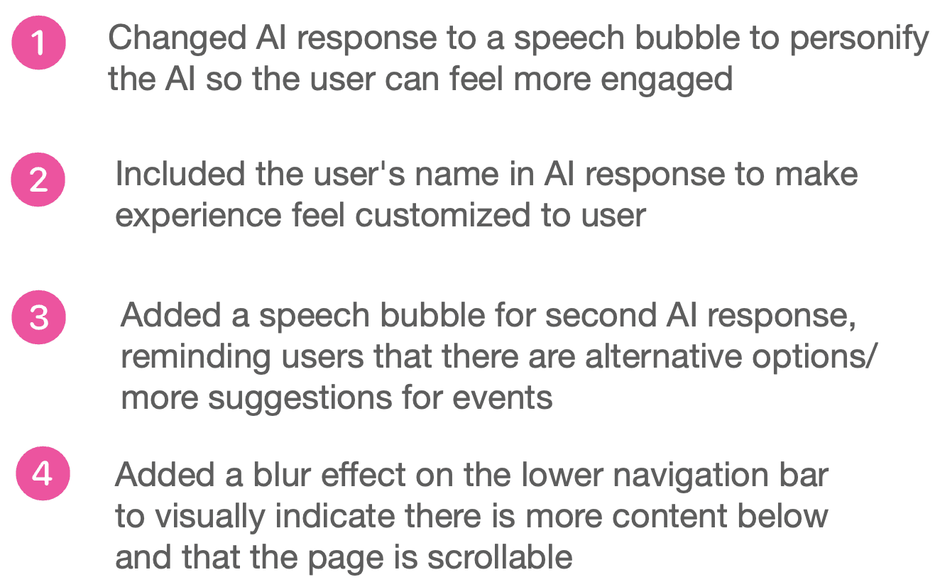
After one round of usability testing with 5 participants, we were provided with plenty of feedback that allowed us to iterate on our mid-fidelity design and improve our design concept. Below are some of the features that we updated in response to the user testing.
We then conducted a second round of usability tests among another 5 participants and found a huge improvement overall.
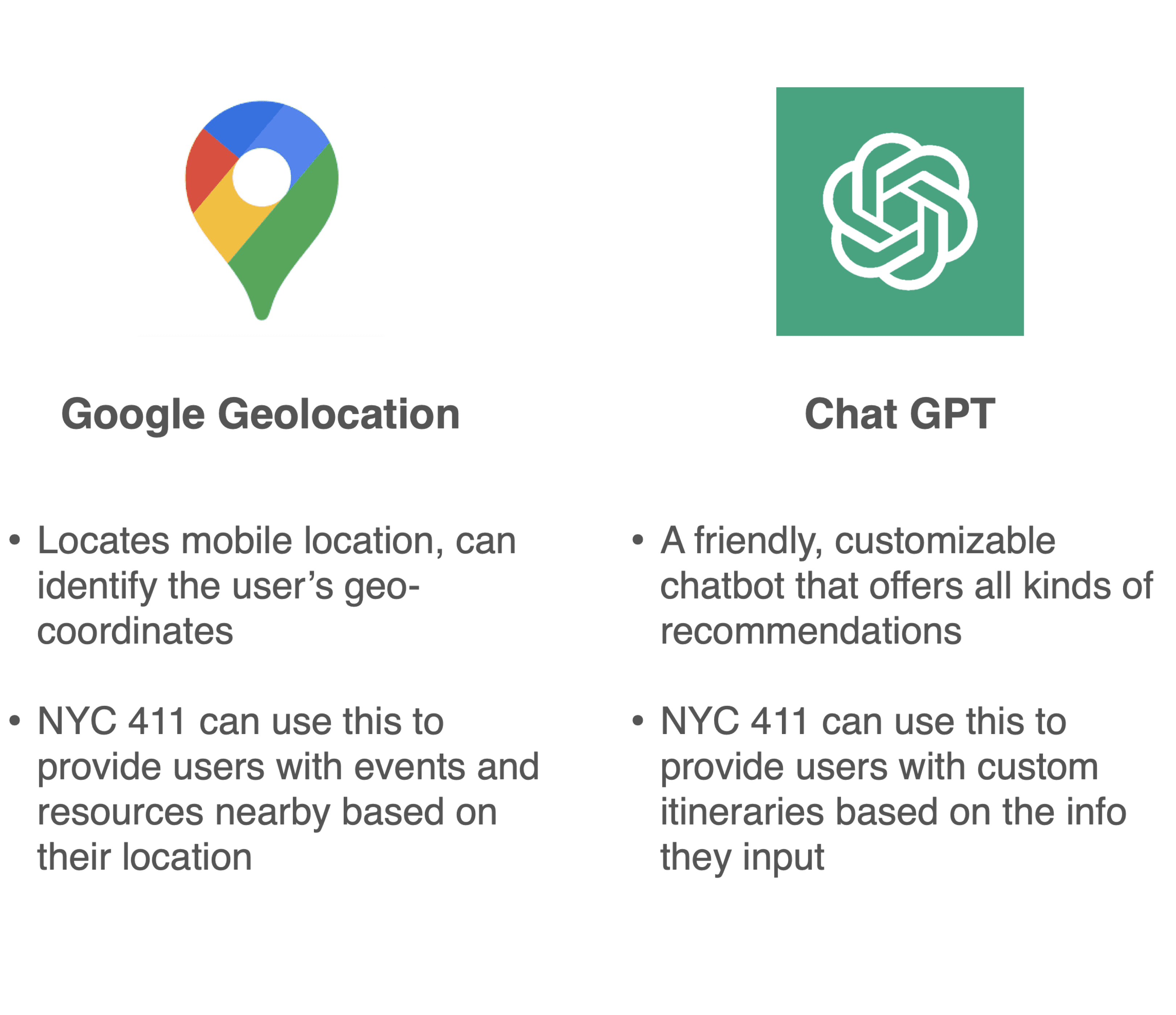
Here are some of the APIs we think can successfully be integrated into our NYC 411 app.
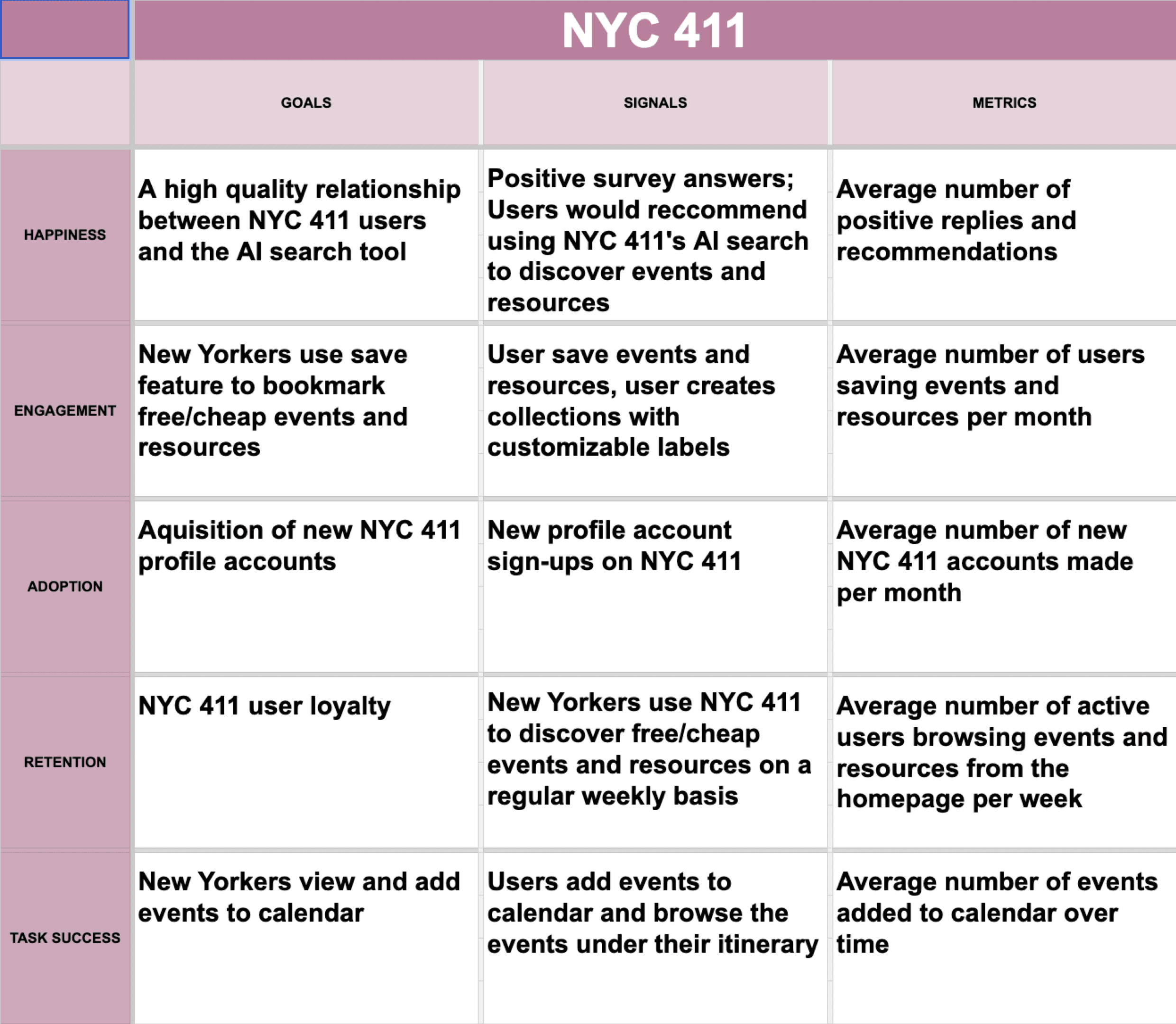
We also created a heart framework to organize the way in which we would collect user metrics across a variety of traits (happiness, engagement, etc.)
Potential KPIs
Heart Framework
Engagement and retention would provide us with the most helpful data given that our app would be new. We would want to learn both how much our users are engaging with the app on a regular basis, and how much users actually stay active on the app over a long period of time.
Ultimately...
We hope that our app stands as a beacon of convenience and accessibility for every New Yorker. By seamlessly integrating centralized public resources, free and affordable events, and accessible amenities into one platform, we empower users to navigate the city with full of excitement. Our AI-driven itinerary planning feature ensures that every outing is optimized for efficiency and enjoyment.
With our app and our partner NYC 311 who has massive public information and resources for New Yorkers, we all together, exploring New York City becomes not just a journey, but a personalized adventure tailored to each user's preferences and needs.
Picking Flowers Event


Planning Itinerary with AI


We then conducted a second round of usability tests among another 5 participants and found a huge improvement overall.
Here are some of the APIs we think can successfully be integrated into our NYC 411 app.
We also created a heart framework to organize the way in which we would collect user metrics across a variety of traits (happiness, engagement, etc.)
Potential KPIs
Heart Framework
Engagement and retention would provide us with the most helpful data given that our app would be new. We would want to learn both how much our users are engaging with the app on a regular basis, and how much users actually stay active on the app over a long period of time.
We hope that our app stands as a beacon of convenience and accessibility for every New Yorker. By seamlessly integrating centralized public resources, free and affordable events, and accessible amenities into one platform, we empower users to navigate the city with full of excitement. Our AI-driven itinerary planning feature ensures that every outing is optimized for efficiency and enjoyment.
With our app and our partner NYC 311 who has massive public information and resources for New Yorkers, we all together, exploring New York City becomes not just a journey, but a personalized adventure tailored to each user's preferences and needs.
Learning about Free NYC Resources
Saving a Free Event
Connect with me
© 2024 – designed by Esmeralda Pineda
Powered by iced matcha lattes 🍵
Key Features


Planning Itinerary with AI


Potential KPIs
Picking Flowers Event


NYC 411
Discover free NYC events
Solution
A centralized platform where New Yorkers can search, discover, and filter from a variety of free/cheap activities in NYC.
Social: Help New Yorkers foster a deeper connection to their community by connecting them to events and places where they can meet others, especially those with similar interests.
Explorative: Fuel the curious and explorative side of New Yorkers by serving as a comprehensive guide for discovering what the boroughs have to offer.
Informative: Ensure New Yorkers don’t feel left in the dark by being a reliable source of information for free, public resources.
Accessible: Provide more bathroom visibility by informing New Yorkers where they can find and access bathrooms nearby, while also ensuring they can find bathrooms with the amenities they need (diaper changing table, wheelchair accessibility, cleanliness, etc.).
81 sec
44%
45%
Faster task completion time
Increase in average success rate
Increase in task easiness rating
Our Process
A look into our methodology
Research
Hypothesis
Individuals who frequent New York City want to learn about free events, public resources, cheap restaurants, and accessible bathrooms in different NYC locations.
New Yorkers don’t know what public resources are available to them.
New Yorkers like to have a list documenting places they would like to visit.
New Yorker’s want free or cheap events/food/parks/museum
Assumptions
Research Methods
Before we conducted our research we brainstormed a list of assumptions to help guide us through our research.
To better empathize with our client & target audience we conducted various research techniques to further our understanding and validate our assumptions. We completed the following research methods to establish a solid foundation before continuing toward the redesign:

Feature Comparison & Competitive Analysis
We conducted a competitive analysis and feature comparison of existing businesses NYC 411 could potentially partner up with. We found out that NYC 311 has the largest NYC audience base out of all the businesses we researched, as the app is directed towards connecting New Yorkers to a channel where they can file complaints or learn about available public resources.
Our biggest takeaways were that NYC 311 has many of the features we would like to focus on for our own app, but is missing many of the features their top competitors have. By partnering with NYC 311, we could provide their audience with features that are pivotal to our app, NYC 411, such as: price filters, a calendar view, and of course, a focus on discovering free and affordable events and resources.
Check out the link below for the full analysis!
Feature Analysis
User Interviews
Who are we designing for?
For our interviews, we wanted to make sure we were interviewing New Yorkers as they would give us the most relevant and recent feedback on their New York experiences. Using a screener survey, we were able to find 5 individuals who frequent at least one NYC neighborhood on a regular basis.
Quotes from Gorilla Users
Let’s Meet Olivia...
After conducting our interviews, we created a persona to represent our target audience. Our persona in this case is Olivia. Olivia helped guide our design decisions, as we specifically implemented product features to best meet her needs and mitigate her pain points.
+Click to view the original Persona!
“Why is it so hard to find fun activities?”
“I love finding good deals.”
Key Takeaways
Olivia wants to go to free/cheap events but doesn’t know where to find them.
Olivia has trouble learning what public resources are available to her.
Olivia wants to organize her events onto a calendar.
Design
“I wish it was easier to save my events”
“What resources does NYC offer?”
Design Changes
Project
Conceptual
Platform
Mobile iOS
2-week sprint
Timeline
View
Figma Prototype
Figma, Google Workspace, Otter AI, Notion, Slack, Keynote
Business Model Canvas, Competitive/Comparative Feature Analysis, Feature Comparison, User Interviews, Affinity Mapping, User Persona, Feature Prioritization Matrix, Sketching & Design Studio, Wireframing, Prototyping & Iterating, Usability Testing, Heart Framework
Methodologies
Tools
Project Manager, designer
Role
Overview
As a team we decided to address the challenge faced by many New Yorkers
in finding free or affordable events and public resources in NYC. Our goal was to create a platform that is both informative and accessible that can be a “go-to" for all things New York City related. Our project emphasizes the collaboration with NYC 311, and references the use of APIs including ChatGPT and Google’s geolocation to ensure easier navigation and a seamless user experience. Ultimately, we prioritized creating a platform that centralized information on events, public resources, affordable restaurants, and accessible bathrooms.
Challenge
How might we find a way for individuals who frequent NYC with opportunities to learn about all of the affordable events and resources that NYC has to offer?
New Yorkers struggle to find events and places in NYC. There are no integrated platform for comprehensive information yet. They rely on digital tools like websites and maps systems however, those platforms are lacking of centralized data on public resources and amenities.
To give us insight into the current market space, and potential businesses that we could benefit from partnering with:
To understand NYC 411’s target audience and align our designs with the needs and pain points of their users we conducted the following:
To ideate and test our design concepts, and how we could measure KPIs:
Business Model Canvas
Competitive/Comparative Feature Analysis
Feature Comparison
User interviews
Affinity Mapping
Synthesis
Persona
Feature Prioritization Matrix
Design Studio
Prototyping
Usability Testing
Heart Framework
1
2
3
4
5
6
7
Project Kickstart
Research
Persona
Design
Prototyping
User Study
Deliver
Final Solution
Price Filtering
Calendar view
Free and affordable
Affinity Mapping
Through affinity mapping, we decided to focus on themes for difficulty discovering, NYC public resources, and saving money. We then pulled the following “I” statements from the category themes we created during affinity mapping. They helped give us a focus for creating our persona.
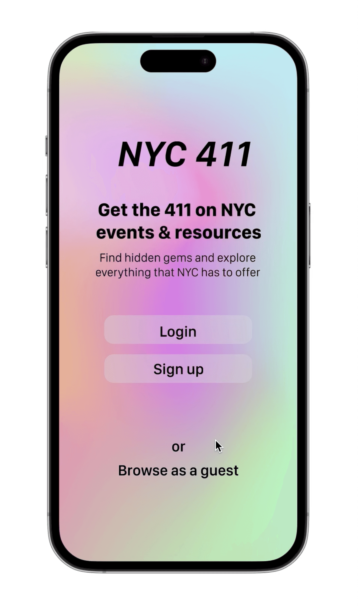
Introducing
NYC 411...
Saving a Free Event
Learning about Free NYC Resources


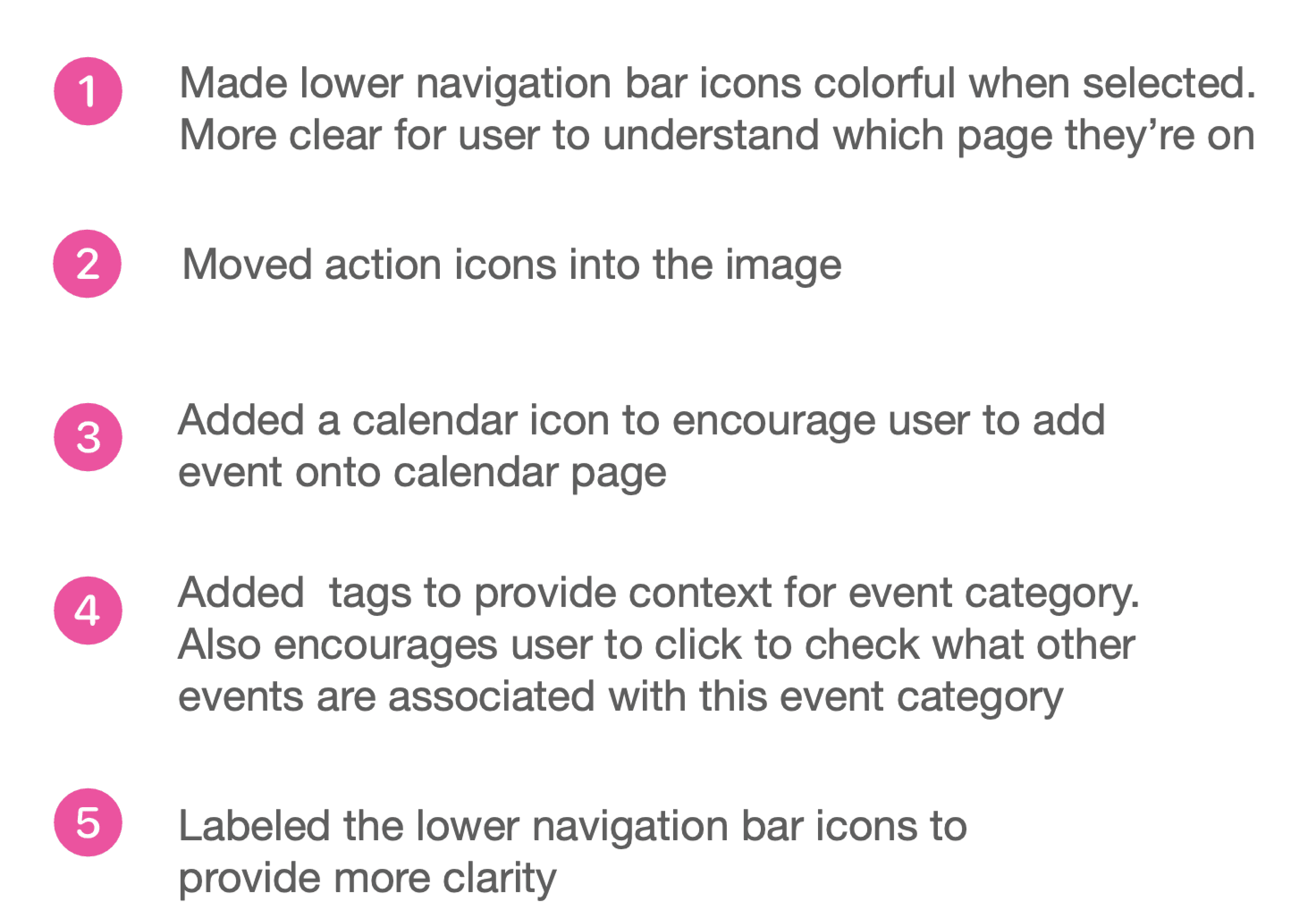
After one round of usability testing with 5 participants, we were provided with plenty of feedback that allowed us to iterate on our mid-fidelity design and improve our design concept. Below are some of the features that we updated in response to the user testing.
We then conducted a second round of usability tests among another 5 participants and found a huge improvement overall.
Implementation
Heart Framework
We also created a heart framework to organize the way in which we would collect user metrics across a variety of traits (happiness, engagement, etc.)
Engagement and retention would provide us with the most helpful data given that our app would be new. We would want to learn both how much our users are engaging with the app on a regular basis, and how much users actually stay active on the app over a long period of time.
We hope that our app stands as a beacon of convenience and accessibility for every New Yorker. By seamlessly integrating centralized public resources, free and affordable events, and accessible amenities into one platform, we empower users to navigate the city with full of excitement. Our AI-driven itinerary planning feature ensures that every outing is optimized for efficiency and enjoyment.
With our app and our partner NYC 311 who has massive public information and resources for New Yorkers, we all together, exploring New York City becomes not just a journey, but a personalized adventure tailored to each user's preferences and needs.
Planning an Itinerary with AI




Design
Implemenation
Connect with me
© 2024 – designed by Esmeralda Pineda
Powered by iced matcha lattes 🍵
Connect with me
© 2024 – designed by Esmeralda Pineda
Powered by iced matcha lattes 🍵