With our redesign we hope to have realized Gorilla’s value statement of power and simplicity by taking out vestigial elements of the site that were getting in the way of new users’ ability to quickly and efficiently use the most popular functions.
We further leaned into simplicity by allowing the users to quickly and easily search and filter through a complex library of functions, allowing them more efficiently use the tool.
Finally, we have, where we found it necessary, combined and renamed pages to provide a more approachable interface overall.
We think that some of these changes can be implemented incrementally, and that each change stands on its own to better improve usability.
As of May 28th, Gorilla has been implementing our changes incrementally, Check out their site with the link below!
Final Thoughts
Gorilla Website
Task 1: You are an undergraduate student currently working on a research project! Check out the list of all of the potential templates you could use.
Task 2: You are researching how people perceive different stimuli. Find the Visual Search Task.
Task 3: You’re creating a project to test the reaction time for different types of stimuli. Find a stroop task and duplicate it.
A modern platform redesign

Search

Jasmine

Create New Project
Get started on a project with Gorilla’s simple yet powerful tools
View All Projects
Classic Stroop Task, in which colour names mismatch and match their test colour. Check out our dedicated page about the Stroop Effect.
Stroop Task
Red
Yellow
Red
Green
Red
Yellow
Yellow
Green
Blue
Yellow
Yellow
Green
Blue
Red
Yellow
Red
Blue
Red
Green
Green
Blue
Blue
Green
Green
View Template
Try as participant
Or
View Template
Try as participant
Or
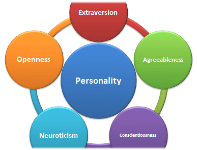
Classic 10 Item Personality Inventory (TIPI) Questionnaire of the BIG 5 Personality Measure
The Big 5 Personality
Reference: Wikipedia
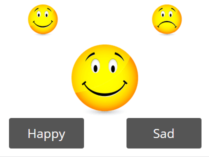
Classic semantic priming task; targets are paired with related neutral primes.
Semantic Priming
Reference: Wikipedia
View Template
Try as participant
Or
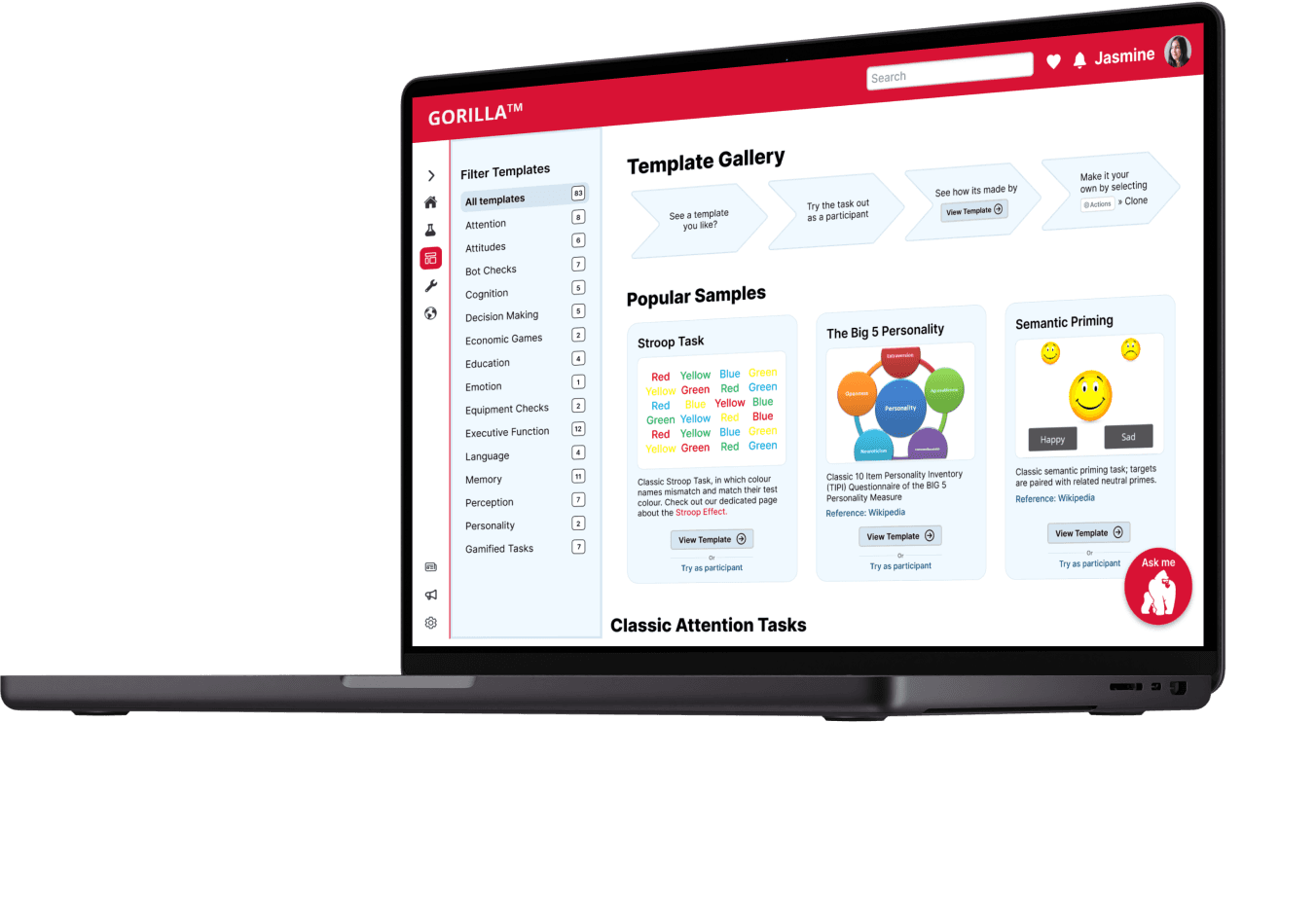
Check out our Template Gallery. Choose from our many templates and make it your own.
Template Gallery
View All Templates »
Red
Yellow
Red
Green
Red
Yellow
Yellow
Green
Blue
Yellow
Yellow
Green
Blue
Red
Yellow
Red
Blue
Red
Green
Green
Blue
Blue
Green
Green


+50 Templates
Check out our template gallery!
Ask me
Gorilla Experiment Builder
A modern platform redesign
Solution
An intuitive building experience
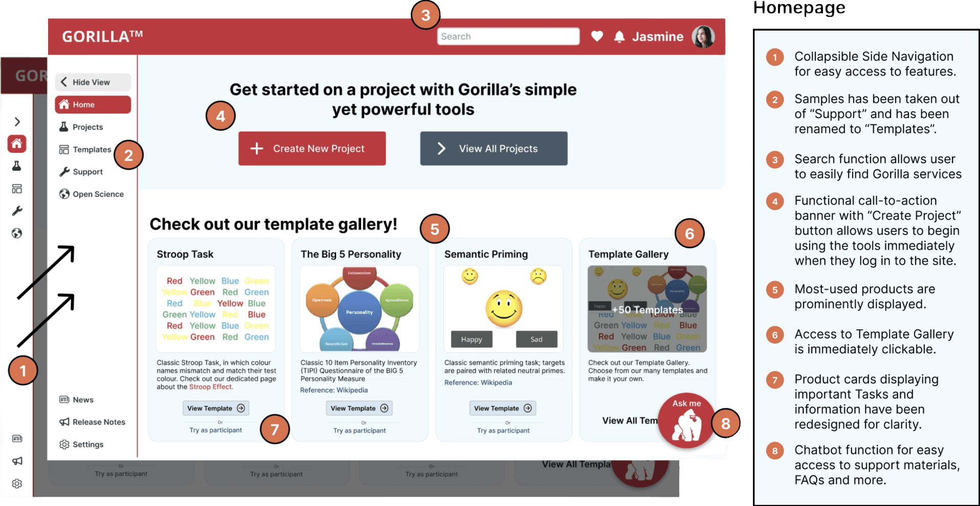
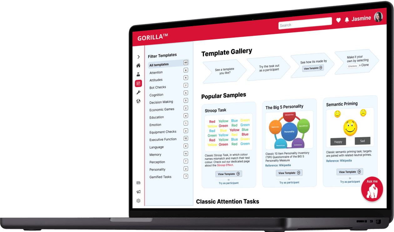
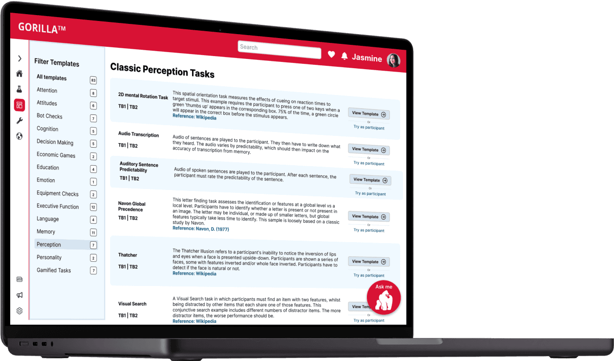
A streamlined homepage for new and existing users to jump in and start building their experiments and an updated marketing page to showcase Gorilla's existing templates.
Improved clarity & consistency of Gorilla’s content strategy.
Global side navigation for the user to know where they are within the builder.
New banner with the ability to create a new or view all project’s.
Template gallery view on the homepage for user’s to easily get started.
A “Gorilla Ask Me” Chatbot button sticky to the corner for user’s to easily find help whenever they need it.
81 sec
44%
45%
Faster task completion time
Increase in average success rate
Increase in task easiness rating
Our Process
A look into our methodology
Research
Hypothesis
Students need a lower barrier to entry for learning the skills required to utilize Gorilla, as well as a reliable way to find answers to their problems/blockers.
Students have difficulty finding the information they need after having skipped the recommended tutorials they are prompted to watch upon logging in for the first time.
Students come to Gorilla in order to run and complete research projects they have been assigned in a class.
Students do not want to build an experiment from scratch if they don’t have to.
Assumptions
Research Methods
To give us insight into Gorilla's platform, their competitors, and to create design changes that aligned with their values we conducted the following:
To establish a baseline of Gorilla's current website usability we conduced the following:
To understand Gorilla's target audience and align our designs with the needs and pain points of their user's we conducted the following:
Desk Research
Feature Analysis
Heuristic Evaluation
Usability Testing
Tree Testing
User interviews
Affinity Mapping
Synthesis
Persona
Journey Map
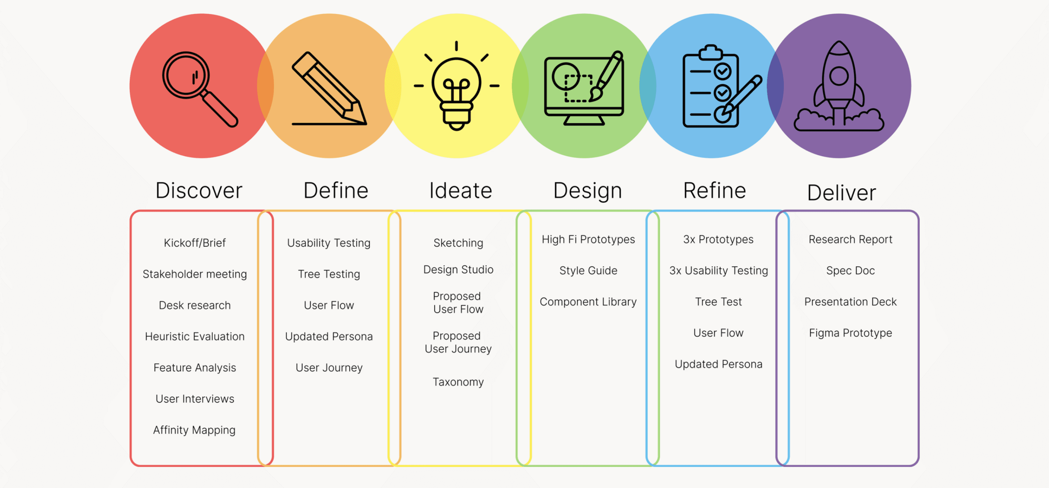
Before we conducted our research we brainstormed a list of assumptions to help guide us through our research.
To better empathize with our client & target audience we conducted various research techniques to further our understanding and validate our assumptions. We completed the following research methods to establish a solid foundation before continuing toward the redesign:
Heuristic Evaluation
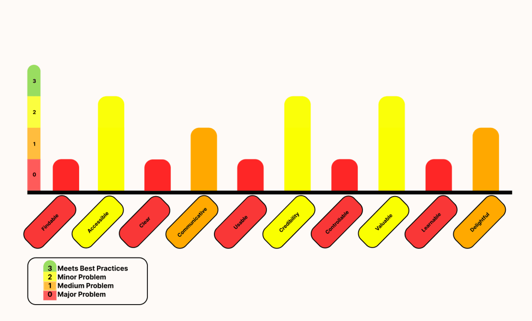
We conducted a comprehensive heuristic evaluation of Gorilla's homepage and samples marketing page to establish a baseline understanding of the site's current usability and identify areas for improvement. Our biggest takeaways were the following:
Findability: There are flaws in the site's information architecture causing the user to struggle when finding relevant content
Clarity: There is an overwhelming amount of information that lacks clear taxonomy and UI hierarchy causing the user to not know where they should focus their attention.
Learnability: There is no clear indication of how a user should navigate the site, where they should start, and how they can find support.
Check out the links below for the full evaluation:

Homepage

Samples Page
Feature Analysis
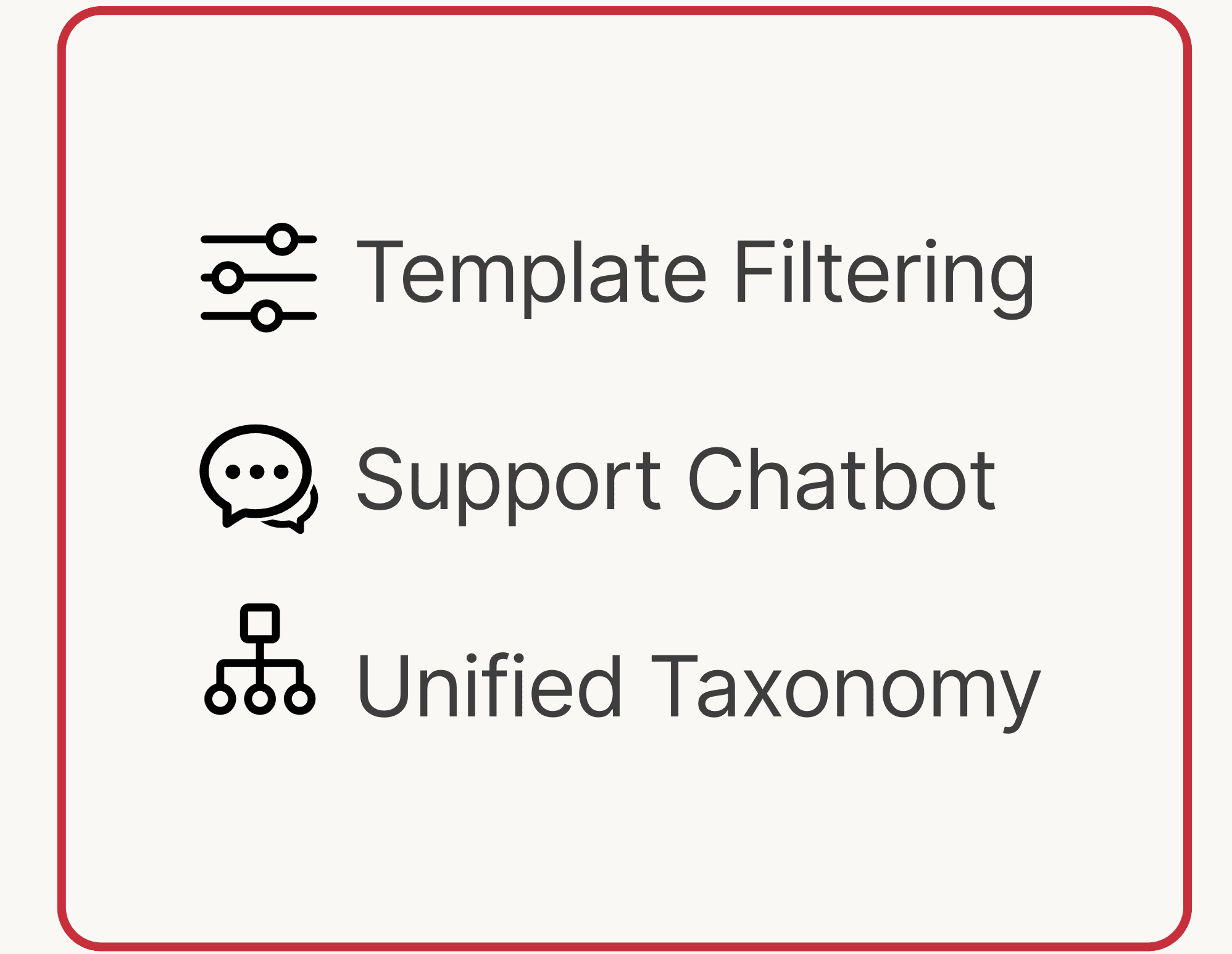
We conducted a competitive & comparative feature analysis of Gorilla's top competitors to understand industry best practices. Our biggest takeaways were from analyzing Testable & Maze. We loved the following features and kept these in mind when deciding on our features to add to our redesign.
Check out the link below for the full analysis!
Feature Analysis
Initial Gorilla Site Testing
Task & Scenario
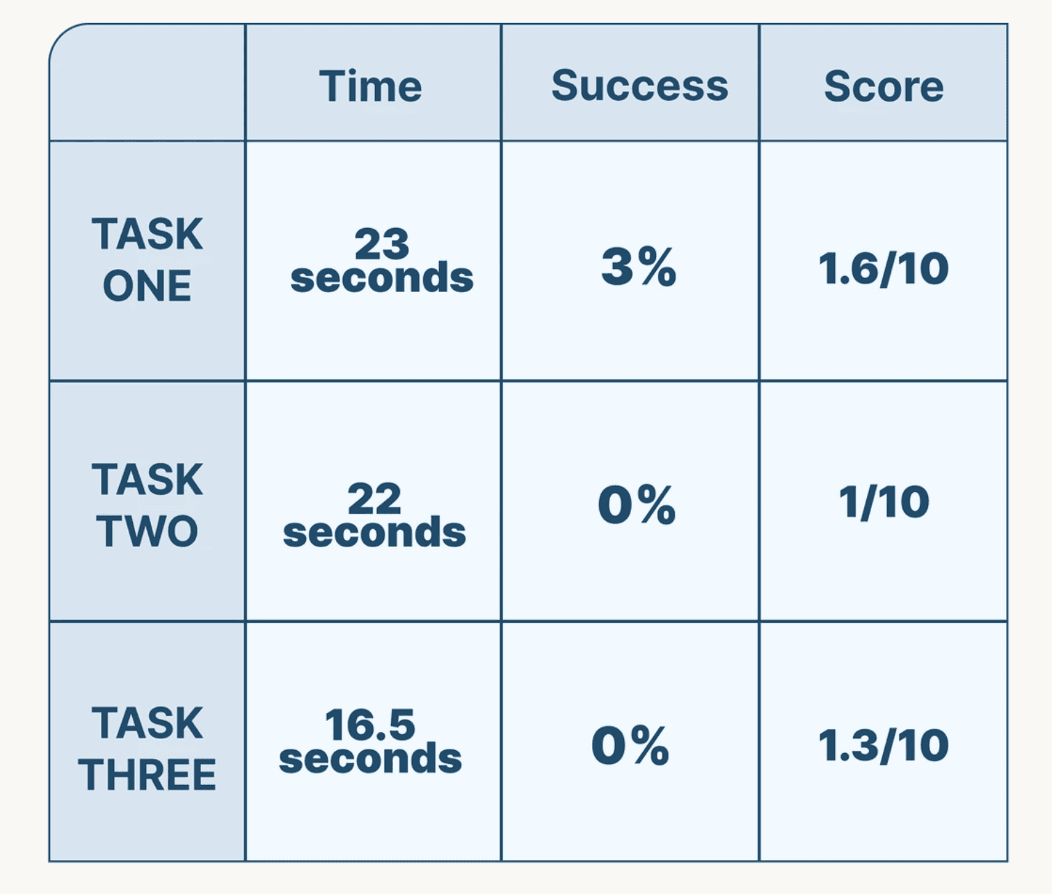
We set out to test the existing site using three tasks which got to the heart of the needs of our target user. Later in this report you will see how our design changes improved upon our metrics.
Used for: Usability Testing, Tree Testing, and User Flows

The Average Scores of 13 Participants
Usability Testing
We conducted an initial usability testing of Gorilla's current website to set baseline datapoints for comparison to our redesign.
Tree Testing
In addition to this, we also wanted to see how it would be if we took design out of the equation and looked only at the taxonomy. In this case, the language being used and how users navigate through the site.
The Average Scores of 11 Participants
User Interviews
Who are we designing for?
We conducted user interviews to better understand Gorilla users' needs, pain points, and to gather insights that could inform our design decisions. Our biggest takeaways were powerful quotes from Gorilla Users.
Quotes from Gorilla Users
“My professor told us “don’t reinvent the wheel” when designing experiments. ”
“I spent a month and a half learning Gorilla and the same amount of time finishing the experiment and dealing with the data"
“I used Google to find my answers on Gorilla”
“When I jump to the difficult task, the task becomes too difficult that these demos are no longer helpful.”
“I wish it was easier to create my experiments to my personal vision”
“I wish that I had someone there walking me through it.”
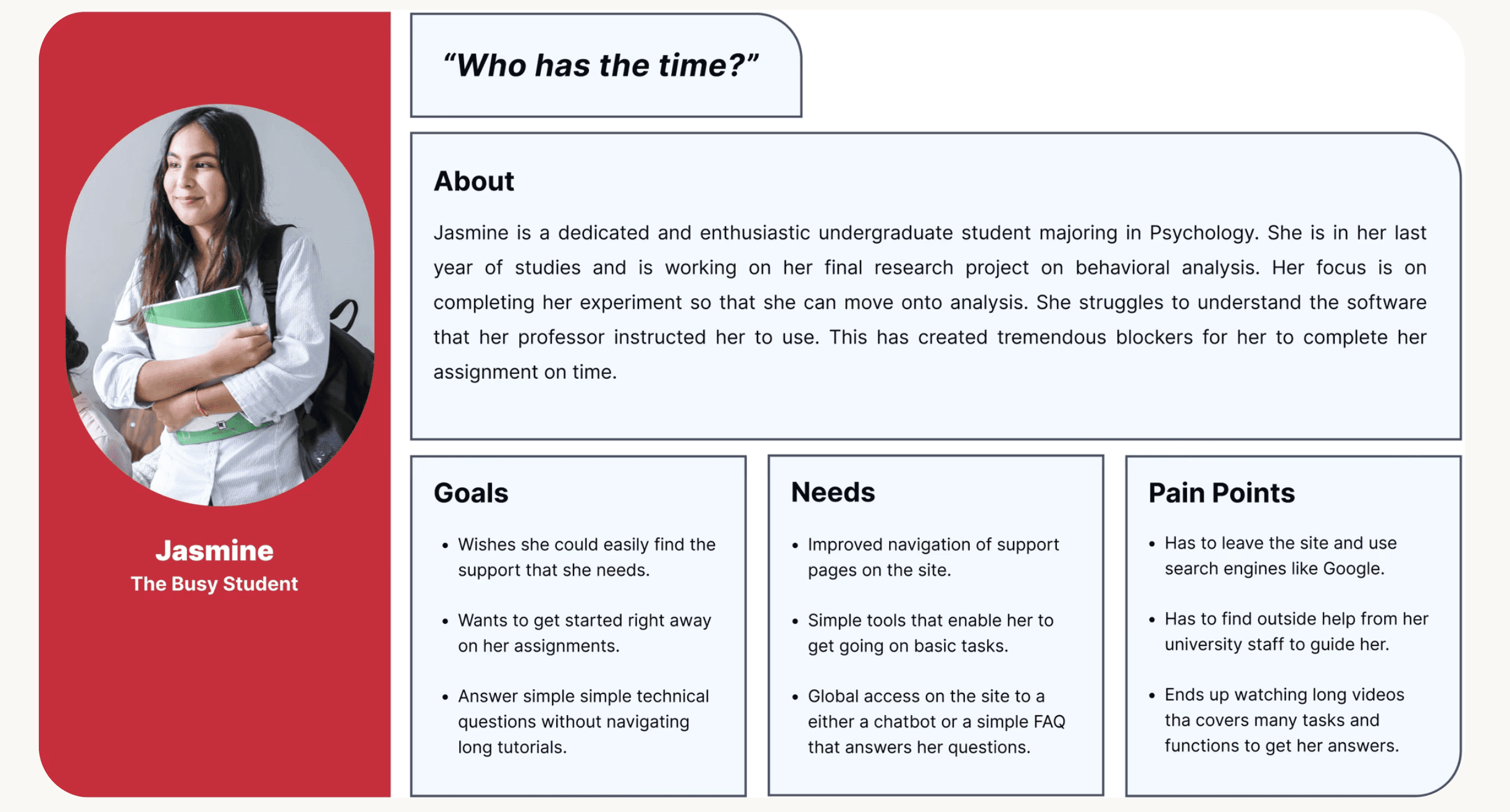
Let’s Meet Jasmine...
After conducting our interviews, we revised the user persona that Gorilla had provided. Overall our changes were minor but we decided to highlight the following based on the insights from our interviews:
Users have difficulty efficiently navigating Gorilla's website and need intuitive information architecture and taxonomy so they can stay within the Gorilla ecosystem.
Users face challenges with onboarding, learning, and finding information that they need to get started with creating their experiment.
Users often use third-party sites (YouTube, Google) and university faculty to learn how to use the experiment builder and questions that come along.
Let’s Meet Jasmine...
After conducting our interviews, we revised the user persona that Gorilla had provided. Overall our changes were minor but we decided to highlight the following based on the insights from our interviews:
Key Takeaways
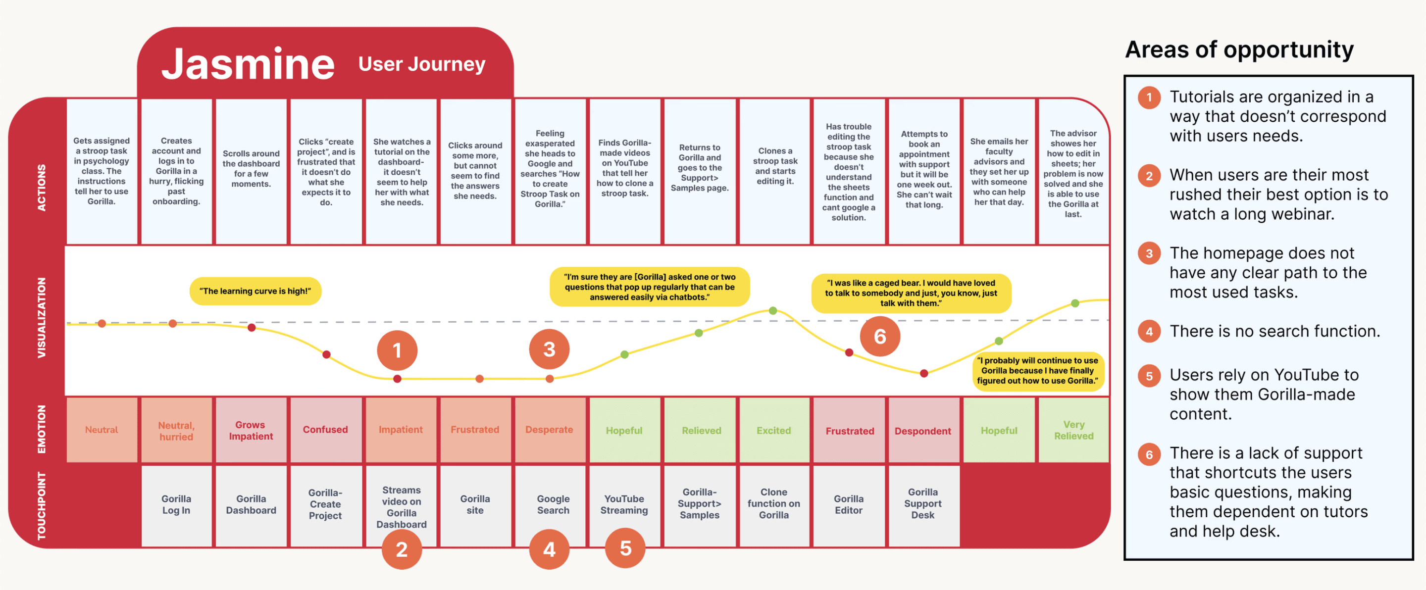
Jasmine's Journey
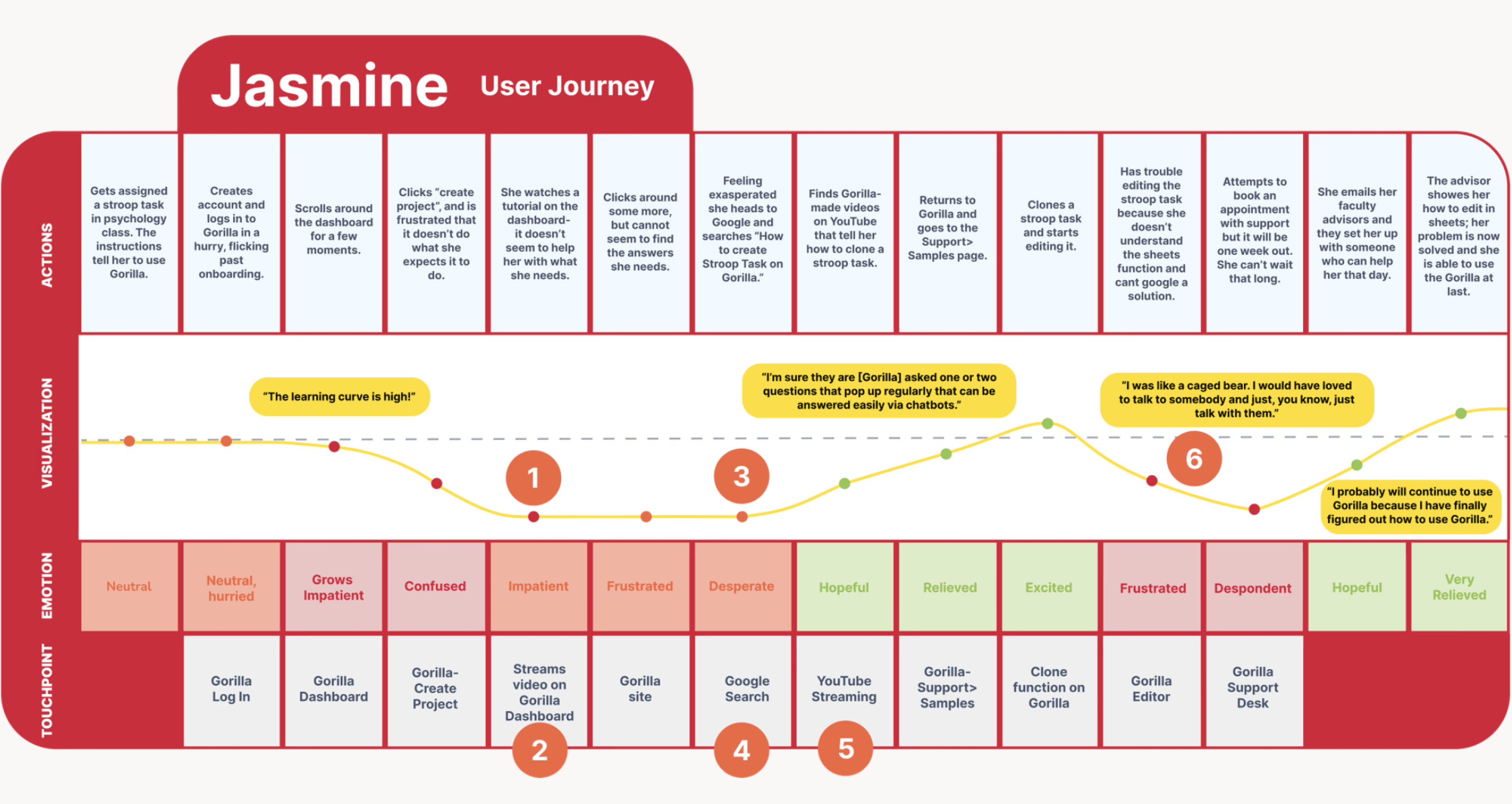
We leveraged our user persona to also create a user journey to better understand at exactly what points a Gorilla user may struggle when navigating the website, creating their experiments, and finding support.
Features
Insights
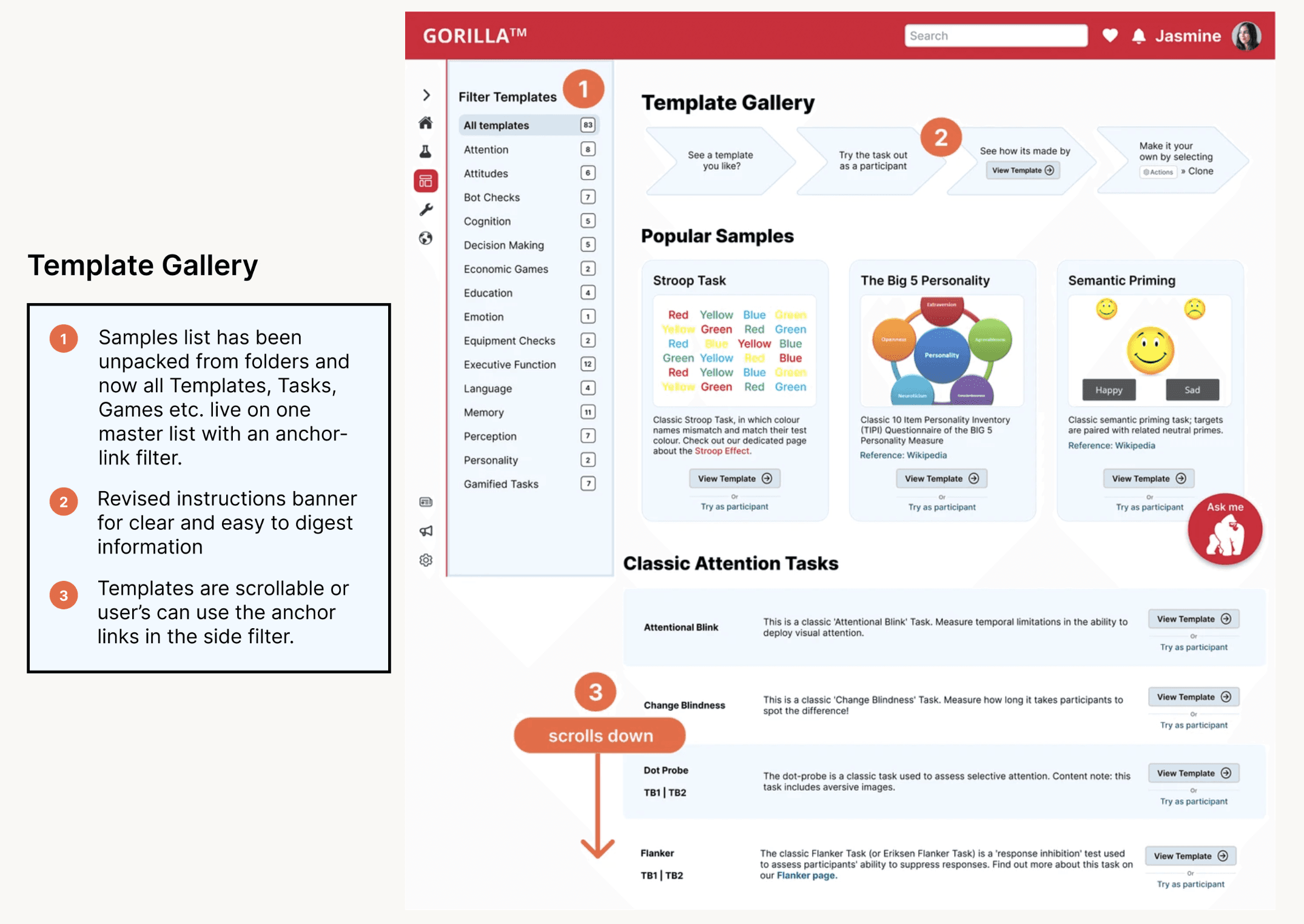
Users need the ability to accurately search for their questions on Gorilla
Global top nav search bar for easy access and for users to stay in the Gorilla ecosystem to avoid 3rd party sites.
Users have difficulty navigating Gorilla's Support Pages and often use 3rd party sites to find there answers.
Global side navigation for easy access to templates and a Gorilla Chatbot.
Design
New Homepage
New Template Gallery

Original Homepage
Original Template Gallery

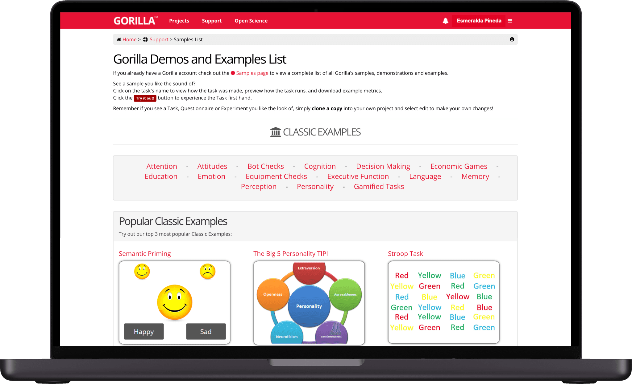
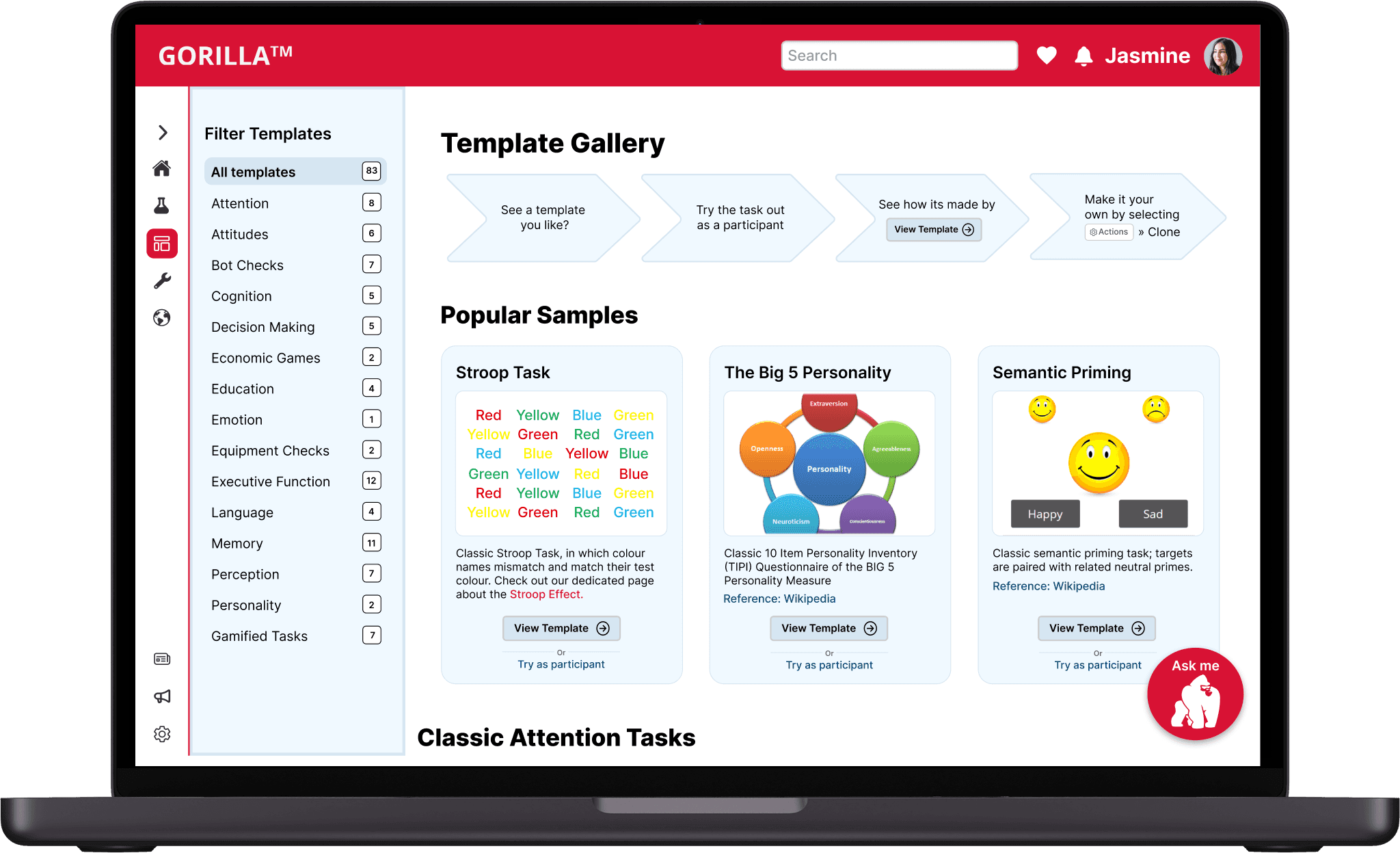
A closer look into our design changes:
Gorilla Redesign Testing
Iteration & Validation
Usability Testing
Tree Testing
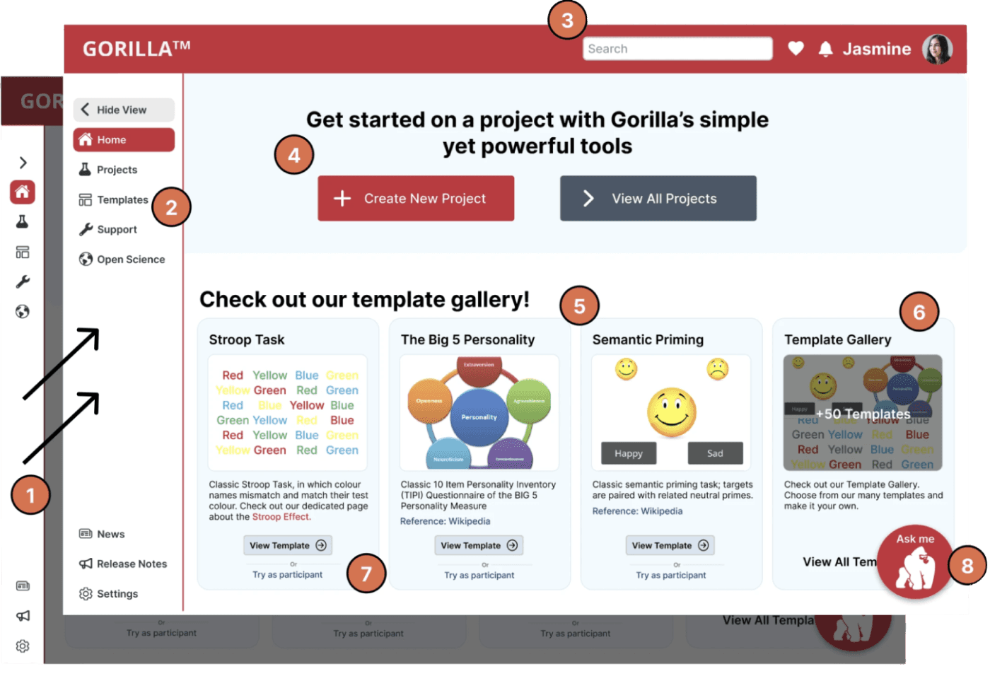
Our final round of three usability tests for the redesign showed significant improvements compared to our initial baseline testing.
Additionally, we conducted a final tree test to evaluate our taxonomy changes, which showed significant improvements compared to our initial baseline testing.
We conducted 3 iterations of our redesign following up with usability testing for each variation along with a tree test of our final IA change.
The Average Scores of 10 Participants
The Average Scores of 12 Participants

Check out the full testing results below!
Maze

Check out the full testing results below!
Optimal Workshop
Delivery
Feel free to take a look!
Handoff to our client, Gorilla
After completing our 3-week sprint, Gorilla Experiment Builder received a comprehensive package of assets including a research report, specification document, presentation deck, Figma prototype, and a style guide. These resources were the accumulation of our design process and outcomes.
Figma Prototype
Final Thoughts
With our redesign we hope to have realized Gorilla’s value statement of power and simplicity by taking out vestigial elements of the site that were getting in the way of new users’ ability to quickly and efficiently use the most popular functions.
We further leaned into simplicity by allowing the users to quickly and easily search and filter through a complex library of functions, allowing them more efficiently use the tool.
Finally, we have, where we found it necessary, combined and renamed pages to provide a more approachable interface overall.
We think that some of these changes can be implemented incrementally, and that each change stands on its own to better improve usability.
As of May 28th, Gorilla has been implementing our changes incrementally, Check out their site with the link below!
Gorilla Website
Users have difficulties discovering information that they need when creating their experiment
Chatbot function with an ability to comb FAQ and other instructional databases within the existing platform.
Overview
Challenge
Gorilla Experiment Builder provides behavioral scientists with an easy-to-use platform for designing a variety of experiments, from simple surveys and reaction-time tasks to complex multi-day learning studies and randomized controlled trials. It allows researchers to efficiently create, launch, and analyze their experiments. My team and I were asked by Gorilla Experiment Builder to redesign their website, enhancing its usability and interface to better meet the needs of their target audience.
The application featured a chaotic layout, posing challenges for users to locate key functionalities. Users grappled with problems during the initial setup phase, influencing the rate of new user integration. The software didn't offer individualistic tailoring or customization possibilities, diminishing its appeal and approachability.
“How might we navigate new users to the correct page where they can learn Gorilla's fundamental tools for creating their own tasks & experiments?
Figma, Optimal Workshop, Maze, Google Workspace, Otter AI, Notion, Zoom, Slack, Keynote
Competitive/Comparative Feature Analysis, Heuristic Analysis, User Interviews, Affinity Mapping, User Persona, User Journey, User Flows, Sketching & Design Studio, Wireframing, Prototyping & Iterating, Tree Testing, Usability Testing
Methodologies
Tools
Project
Client (Contract)
Platform
Website
Role
Timeline
3-week sprint
View
Figma Prototype
Lead UI designer, UX researcher
Iteration & Validation
We conducted 3 iterations of our redesign following up with usability testing for each variation along with a tree test of our final IA change.
The Average Scores of 10 Participants
The Average Scores of 12 Participants
User Interviews
Who are we designing for?
We conducted user interviews to better understand Gorilla users' needs, pain points, and to gather insights that could inform our design decisions. Our biggest takeaways were powerful quotes from Gorilla Users.
Quotes from Gorilla Users
Let’s Meet Jasmine...
Jasmine's Journey
After conducting our interviews, we revised the user persona that Gorilla had provided. Overall our changes were minor but we decided to highlight the following based on the insights from our interviews:
We leveraged our user persona to also create a user journey to better understand at exactly what points a Gorilla user may struggle when navigating the website, creating their experiments, and finding support.
+Click to view the original Persona!
“My professor told us “don’t reinvent the wheel” when designing experiments. ”
“When I jump to the difficult task, the task becomes too difficult that these demos are no longer helpful.”
“I wish it was easier to create my experiments to my personal vision”
Usability Testing
We conducted an initial usability testing of Gorilla's current website to set baseline datapoints for comparison to our redesign.
The Average Scores of 11 Participants


Key Takeaways
A closer look into our design changes:
Homepage:
Templates:
Users have difficulty efficiently navigating Gorilla's website and need intuitive information architecture and taxonomy so they can stay within the Gorilla ecosystem.
Users face challenges with onboarding, learning, and finding information that they need to get started with creating their experiment.
Users often use third-party sites (YouTube, Google) and university faculty to learn how to use the experiment builder and questions that come along.


Design


Tree Testing
In addition, we also wanted to see how it would be if we took design out of the equation and looked only at the taxonomy. In this case, the language being used and how users navigate through the site.
“I used Google to find my answers on Gorilla”
“I wish that I had someone there walking me through it.”
“I spent a month and a half learning Gorilla and the same amount of time finishing the experiment and dealing with the data"


New Homepage
Original Homepage


Original Template Gallery
New Template Gallery


Usability Testing
Our final round of three usability tests for the redesign showed significant improvements compared to our initial baseline testing.
Check out the full testing results below!



Additionally, we conducted a final tree test to evaluate our taxonomy changes, which showed significant improvements compared to our initial baseline testing.
Tree Testing
Check out the full testing results below!
Optimal Workshop
Delivery
Handoff to our client, Gorilla
After completing our 3-week sprint, Gorilla Experiment Builder received a comprehensive package of assets including a research report, specification document, presentation deck, Figma prototype, and a style guide. These resources were the accumulation of our design process and outcomes.
Final Thoughts
With our redesign we hope to have realized Gorilla’s value statement of power and simplicity by taking out vestigial elements of the site that were getting in the way of new users’ ability to quickly and efficiently use the most popular functions.
We further leaned into simplicity by allowing the users to quickly and easily search and filter through a complex library of functions, allowing them more efficiently use the tool.
Finally, we have, where we found it necessary, combined and renamed pages to provide a more approachable interface overall.
We think that some of these changes can be implemented incrementally, and that each change stands on its own to better improve usability.
Feel free to take a look!
Figma Prototype
As of May 28th, Gorilla has been implementing our changes incrementally, Check out their site with the link below!
Gorilla Website
Tutorials are organized in a way that doesn’t correspond with users’ needs.
When users are their most rushed, their best option is to watch a long webinar.
The homepage does not have any clear path to the most used tasks.
There is no search function.
Users rely on YouTube to show them Gorilla-made content.
There is a lack of support that shortcuts the user’s basic questions, making them dependent on tutors and help desk.
Areas of Opportunity
Insight
Users have difficulty navigating Gorilla's Support Pages and often use 3rd party sites to find there answers.
Global side navigation for easy access to templates and a Gorilla Chatbot.
Users need the ability to accurately search for their questions on Gorilla
Global top nav search bar for easy access and for users to stay in the Gorilla ecosystem to avoid 3rd party sites.
Users have difficulties discovering information that they need when creating their experiment
Chatbot function with an ability to comb FAQ and other instructional databases within the existing platform.
Feature
Insight
Feature
Feature
Insight
Gorilla Redesign Testing


Initial Gorilla Site Testing
Task & Scenario
We set out to test the existing site using three tasks which got to the heart of the needs of our target user. Later in this report you will see how our design changes improved upon our metrics.
Used for: Usability Testing, Tree Testing, and User Flows
The Average Scores of 13 Participants
Task 1: You are an undergraduate student currently working on a research project! Check out the list of all of the potential templates you could use.
Task 2: You are researching how people perceive different stimuli. Find the Visual Search Task.
Task 3: You’re creating a project to test the reaction time for different types of stimuli. Find a stroop task and duplicate it.
Check out the links below for the full evaluation:
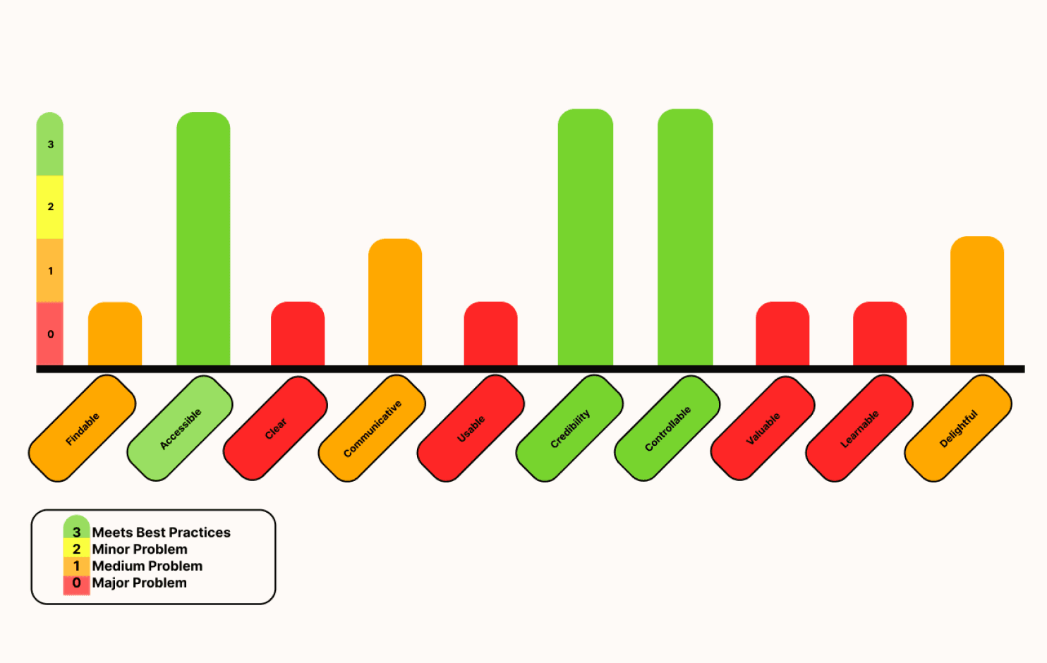
Homepage
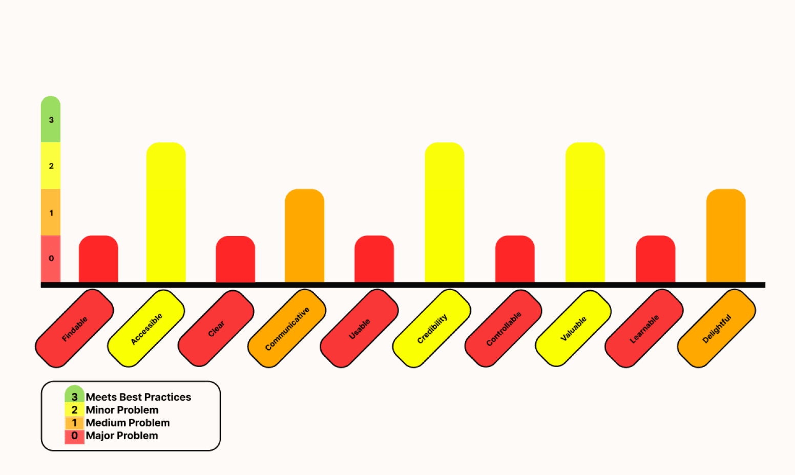
Samples Page
Findability: There are flaws in the site's information architecture causing the user to struggle when finding relevant content
Clarity: There is an overwhelming amount of information that lacks clear taxonomy and UI hierarchy causing the user to not know where they should focus their attention.
Learnability: There is no clear indication of how a user should navigate the site, where they should start, and how they can find support.

Search

Jasmine

Create New Project
Get started on a project with Gorilla’s simple yet powerful tools
View All Projects
Classic Stroop Task, in which colour names mismatch and match their test colour. Check out our dedicated page about the Stroop Effect.
Stroop Task
Red
Yellow
Red
Green
Red
Yellow
Yellow
Green
Blue
Yellow
Yellow
Green
Blue
Red
Yellow
Red
Blue
Red
Green
Green
Blue
Blue
Green
Green
View Template
Try as participant
Or
View Template
Try as participant
Or
Classic 10 Item Personality Inventory (TIPI) Questionnaire of the BIG 5 Personality Measure
The Big 5 Personality
Reference: Wikipedia

Classic semantic priming task; targets are paired with related neutral primes.
Semantic Priming
Reference: Wikipedia

View Template
Try as participant
Or
Check out our Template Gallery. Choose from our many templates and make it your own.
Template Gallery
View All Templates »
Red
Yellow
Red
Green
Red
Yellow
Yellow
Green
Blue
Yellow
Yellow
Green
Blue
Red
Yellow
Red
Blue
Red
Green
Green
Blue
Blue
Green
Green


+50 Templates
Check out our template gallery!
Ask me
Gorilla Experiment Builder
A modern platform redesign
Solution
An intuitive building experience
A streamlined homepage for new and existing users to jump in and start building their experiments and an updated marketing page to showcase Gorilla's existing templates.
Improved clarity & consistency of Gorilla’s content strategy.
Global side navigation for the user to know where they are within the builder.
New banner with the ability to create a new or view all project’s.
Template gallery view on the homepage for user’s to easily get started.
A “Gorilla Ask Me” Chatbot button sticky to the corner for user’s to easily find help whenever they need it.
81 sec
44%
45%
Faster task completion time
Increase in average success rate
Increase in task easiness rating


Our Process
A look into our methodology
Research
Hypothesis
Students need a lower barrier to entry for learning the skills required to utilize Gorilla, as well as a reliable way to find answers to their problems/blockers.
Students have difficulty finding the information they need after having skipped the recommended tutorials they are prompted to watch upon logging in for the first time.
Students come to Gorilla in order to run and complete research projects they have been assigned in a class.
Students do not want to build an experiment from scratch if they don’t have to.
Assumptions
Research Methods
Before we conducted our research we brainstormed a list of assumptions to help guide us through our research.
To better empathize with our client & target audience we conducted various research techniques to further our understanding and validate our assumptions. We completed the following research methods to establish a solid foundation before continuing toward the redesign:


Feature Analysis
We conducted a competitive & comparative feature analysis of Gorilla's top competitors to understand industry best practices. Our biggest takeaways were from analyzing Testable & Maze. We loved the following features and kept these in mind when deciding on our features to add to our redesign.
Check out the link below for the full analysis!
Feature Analysis
Heuristic Evaluation
We conducted a comprehensive heuristic evaluation of Gorilla's homepage and samples marketing page to establish a baseline understanding of the site's current usability and identify areas for improvement. Our biggest takeaways were the following:
Project
Client (Contract)
Platform
Website
3-week sprint
Timeline
View
Figma Prototype
Figma, Optimal Workshop, Maze, Google Workspace, Otter AI, Notion, Zoom, Slack, Keynote
Lead UI designer, UX researcher
Competitive/Comparative Feature Analysis, Heuristic Analysis, User Interviews, Affinity Mapping, User Persona, User Journey, User Flows, Sketching & Design Studio, Wireframing, Prototyping & Iterating, Tree Testing, Usability Testing
Methodologies
Tools
Role
Overview
Gorilla Experiment Builder provides behavioral scientists with an easy-to-use platform for designing a variety of experiments, from simple surveys and reaction-time tasks to complex multi-day learning studies and randomized controlled trials. It allows researchers to efficiently create, launch, and analyze their experiments. My team and I were asked by Gorilla Experiment Builder to redesign their website, enhancing its usability and interface to better meet the needs of their target audience.
Challenge
“How might we navigate new users to the correct page where they can learn Gorilla's fundamental tools for creating their own tasks & experiments?
The application featured a chaotic layout, posing challenges for users to locate key functionalities. Users grappled with problems during the initial setup phase, influencing the rate of new user integration. The software didn't offer individualistic tailoring or customization possibilities, diminishing its appeal and approachability.
To give us insight into Gorilla's platform, their competitors, and to create design changes that aligned with their values we conducted the following:
To establish a baseline of Gorilla's current website usability we conduced the following:
To understand Gorilla's target audience and align our designs with the needs and pain points of their user's we conducted the following:
Desk Research
Feature Analysis
Heuristic Evaluation
Usability Testing
Tree Testing
User interviews
Affinity Mapping
Synthesis
Persona
Journey Map
Maze
2
3
4
5
6
1
Gorilla Redesign Testing
Iteration & Validation
Usability Testing
Tree Testing
Our final round of three usability tests for the redesign showed significant improvements compared to our initial baseline testing.
Additionally, we conducted a final tree test to evaluate our taxonomy changes, which showed significant improvements compared to our initial baseline testing.
We conducted 3 iterations of our redesign following up with usability testing for each variation along with a tree test of our final IA change.
The Average Scores of 10 Participants
The Average Scores of 12 Participants


Search

Jasmine

Create New Project
Get started on a project with Gorilla’s simple yet powerful tools
View All Projects
Classic Stroop Task, in which colour names mismatch and match their test colour. Check out our dedicated page about the Stroop Effect.
Stroop Task
Red
Yellow
Red
Green
Red
Yellow
Yellow
Green
Blue
Yellow
Yellow
Green
Blue
Red
Yellow
Red
Blue
Red
Green
Green
Blue
Blue
Green
Green
View Template
Try as participant
Or
View Template
Try as participant
Or
Classic 10 Item Personality Inventory (TIPI) Questionnaire of the BIG 5 Personality Measure
The Big 5 Personality
Reference: Wikipedia

Classic semantic priming task; targets are paired with related neutral primes.
Semantic Priming
Reference: Wikipedia

View Template
Try as participant
Or
Check out our Template Gallery. Choose from our many templates and make it your own.
Template Gallery
View All Templates »
Red
Yellow
Red
Green
Red
Yellow
Yellow
Green
Blue
Yellow
Yellow
Green
Blue
Red
Yellow
Red
Blue
Red
Green
Green
Blue
Blue
Green
Green


+50 Templates
Check out our template gallery!
Ask me
Gorilla Experiment Builder
Overview
Challenge
Gorilla Experiment Builder provides behavioral scientists with an easy-to-use platform for designing a variety of experiments, from simple surveys and reaction-time tasks to complex multi-day learning studies and randomized controlled trials. It allows researchers to efficiently create, launch, and analyze their experiments. My team and I were asked by Gorilla Experiment Builder to redesign their website, enhancing its usability and interface to better meet the needs of their target audience.
The application featured a chaotic layout, posing challenges for users to locate key functionalities. Users grappled with problems during the initial setup phase, influencing the rate of new user integration. The software didn't offer individualistic tailoring or customization possibilities, diminishing its appeal and approachability.
“How might we navigate new users to the correct page where they can learn Gorilla's fundamental tools for creating their own tasks & experiments?
Figma, Optimal Workshop, Maze, Google Workspace, Otter AI, Notion, Zoom, Slack, Keynote
Lead UI designer, UX researcher
Competitive/Comparative Feature Analysis, Heuristic Analysis, User Interviews, Affinity Mapping, User Persona, User Journey, User Flows, Sketching & Design Studio, Wireframing, Prototyping & Iterating, Tree Testing, Usability Testing
Methodologies
Tools
Project
Client (Contract)
Platform
Website
Timeline
3-week sprint
Role
A modern platform redesign
Solution
An intuitive building experience
A streamlined homepage for new and existing users to jump in and start building their experiments and an updated marketing page to showcase Gorilla's existing templates.
Improved clarity & consistency of Gorilla’s content strategy.
Global side navigation for the user to know where they are within the builder.
New banner with the ability to create a new or view all project’s.
Template gallery view on the homepage for user’s to easily get started.
A “Gorilla Ask Me” Chatbot button sticky to the corner for user’s to easily find help whenever they need it.
81 sec
44%
45%
Faster task completion time
Increase in average success rate
Increase in task easiness rating


Our Process
A look into our methodology
Research
Hypothesis
Students need a lower barrier to entry for learning the skills required to utilize Gorilla, as well as a reliable way to find answers to their problems/blockers.
Students have difficulty finding the information they need after having skipped the recommended tutorials they are prompted to watch upon logging in for the first time.
Students come to Gorilla in order to run and complete research projects they have been assigned in a class.
Students do not want to build an experiment from scratch if they don’t have to.
Assumptions
Research Methods
To give us insight into Gorilla's platform, their competitors, and to create design changes that aligned with their values we conducted the following:
To establish a baseline of Gorilla's current website usability we conduced the following:
To understand Gorilla's target audience and align our designs with the needs and pain points of their user's we conducted the following:
Desk Research
Feature Analysis
Heuristic Evaluation
Usability Testing
Tree Testing
User interviews
Affinity Mapping
Synthesis
Persona
Journey Map
Before we conducted our research we brainstormed a list of assumptions to help guide us through our research.
To better empathize with our client & target audience we conducted various research techniques to further our understanding and validate our assumptions. We completed the following research methods to establish a solid foundation before continuing toward the redesign:


Feature Analysis
We conducted a competitive & comparative feature analysis of Gorilla's top competitors to understand industry best practices. Our biggest takeaways were from analyzing Testable & Maze. We loved the following features and kept these in mind when deciding on our features to add to our redesign.
Check out the link below for the full analysis!
Feature Analysis
Heuristic Evaluation
User Interviews
Who are we designing for?
We conducted user interviews to better understand Gorilla users' needs, pain points, and to gather insights that could inform our design decisions. Our biggest takeaways were powerful quotes from Gorilla Users.
Quotes from Gorilla Users
Let’s Meet Jasmine...
Jasmine's Journey
After conducting our interviews, we revised the user persona that Gorilla had provided. Overall our changes were minor but we decided to highlight the following based on the insights from our interviews:
We leveraged our user persona to also create a user journey to better understand at exactly what points a Gorilla user may struggle when navigating the website, creating their experiments, and finding support.
“My professor told us “don’t reinvent the wheel” when designing experiments. ”
“When I jump to the difficult task, the task becomes too difficult that these demos are no longer helpful.”
“I wish it was easier to create my experiments to my personal vision”
“I used Google to find my answers on Gorilla”
“I wish that I had someone there walking me through it.”
“I spent a month and a half learning Gorilla and the same amount of time finishing the experiment and dealing with the data"
Initial Gorilla Site Testing
Task & Scenario
Usability Testing
Tree Testing
We conducted an initial usability testing of Gorilla's current website to set baseline datapoints for comparison to our redesign.
In addition to this, we also wanted to see how it would be if we took design out of the equation and looked only at the taxonomy. In this case, the language being used and how users navigate through the site.
We set out to test the existing site using three tasks which got to the heart of the needs of our target user. Later in this report you will see how our design changes improved upon our metrics.
Used for: Usability Testing, Tree Testing, and User Flows
The Average Scores of 13 Participants
The Average Scores of 11 Participants
Task 1: You are an undergraduate student currently working on a research project! Check out the list of all of the potential templates you could use.
Task 2: You are researching how people perceive different stimuli. Find the Visual Search Task.
Task 3: You’re creating a project to test the reaction time for different types of stimuli. Find a stroop task and duplicate it.
We conducted a comprehensive heuristic evaluation of Gorilla's homepage and samples marketing page to establish a baseline understanding of the site's current usability and identify areas for improvement. Our biggest takeaways were the following:
Findability: There are flaws in the site's information architecture causing the user to struggle when finding relevant content
Clarity: There is an overwhelming amount of information that lacks clear taxonomy and UI hierarchy causing the user to not know where they should focus their attention.
Learnability: There is no clear indication of how a user should navigate the site, where they should start, and how they can find support.
Check out the links below for the full evaluation:


Homepage

Samples Page


Key Takeaways
A closer look into our design changes:
Insights
Users have difficulty navigating Gorilla's Support Pages and often use 3rd party sites to find there answers.
Global side navigation for easy access to templates and a Gorilla Chatbot.
Users need the ability to accurately search for their questions on Gorilla
Global top nav search bar for easy access and for users to stay in the Gorilla ecosystem to avoid 3rd party sites.
Users have difficulties discovering information that they need when creating their experiment
Chatbot function with an ability to comb FAQ and other instructional databases within the existing platform.
Features
Users have difficulty efficiently navigating Gorilla's website and need intuitive information architecture and taxonomy so they can stay within the Gorilla ecosystem.
Users face challenges with onboarding, learning, and finding information that they need to get started with creating their experiment.
Users often use third-party sites (YouTube, Google) and university faculty to learn how to use the experiment builder and questions that come along.

Design


Check out the full testing results below!
Check out the full testing results below!
Maze
Optimal Workshop
Figma Prototype


Delivery
Feel free to take a look!
Handoff to our client, Gorilla
After completing our 3-week sprint, Gorilla Experiment Builder received a comprehensive package of assets including a research report, specification document, presentation deck, Figma prototype, and a style guide. These resources were the accumulation of our design process and outcomes.
View
Figma Prototype
Areas of Opportunity
Tutorials are organized in a way that doesn’t correspond with users’ needs.
When users are their most rushed, their best option is to watch a long webinar.
The homepage does not have any clear path to the most used tasks.
There is no search function.
Users rely on YouTube to show them Gorilla-made content.
There is a lack of support that shortcuts the user’s basic questions, making them dependent on tutors and help desk.
1
2
3
4
5
6


New Homepage
New Template Gallery


Original Homepage
Original Template Gallery


Connect with me
© 2024 – designed by Esmeralda Pineda
Powered by iced matcha lattes 🍵